Banner ads are one of the most prolific forms of display advertising used in today’s online marketing. However, as with any marketing campaign, the success of a banner campaign boils down to creative quality or specifically banner ad sizes when it comes to banner advertising.
Your banner ads must be compelling, attractive, and catchy. Only then will your marketing message get the opportunity to witness a breakthrough in the competitive online advertising space. Things like animation, the use of faces, brand colors, and clear text help banner ads stand out.
In this article, I will bend over backward to guide you on how to build better ads that ultimately drive stronger banner performance in the advertising space.
Table of Contents
ToggleWhat is Banner Advertising?
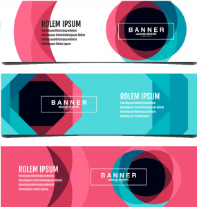
A banner ad is a digital billboard or display board using images to draw attention and send a message to the consumer about a product.
A great banner ad draws the reader’s attention through images of what’s being advertised. They’re bright, welcoming, and don’t have much text, instead of using images or multimedia to convey a message for overall brand consideration.
Top performing Banner Advertising in 2022
Are you looking for the most attractive banner sizes to draw subscribers’ attention in 2022? When you are pouring money into Google, it is important to be aware of the banner ad sizes that could generate the most amount of attention and draw the conversion to your brand.
Not knowing the appropriate banner ad sizes is one of the biggest mistakes made in banner advertising, one that could result in a waste of a lot of resources.
Here is a list of 5 top-performing banner ads you could think of using to increase clicks, sales, and conversion.
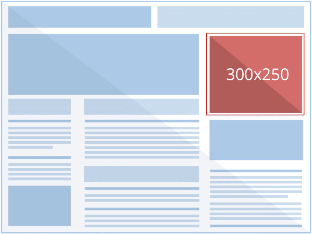
#1. Medium rectangle (300×250 ad size)
This type of banner ad is the most portable one out of all these options so it doesn’t take up much space on a web page. It does well when it’s ingrained within text content or when it’s placed at the end of an article.
Because of the convenient size, advertisers tend to prefer it because it’s advantageous to display. At the same time, it’s a good option when you’re just getting started with display ads.

#2. Large rectangle (336×280 ad size)
The Large Rectangle (336×280) is also a top-performing ad size as suggested by Google. Even though this banner ad size doesn’t get as many impressions as the first one, it’s still a popular option for advertisers.
Since it’s identical to the medium rectangle, it performs best when it’s placed within text content or at the end of a post. Because it’s slightly bigger than the 300×250 ad size, it means that you will have more ad director


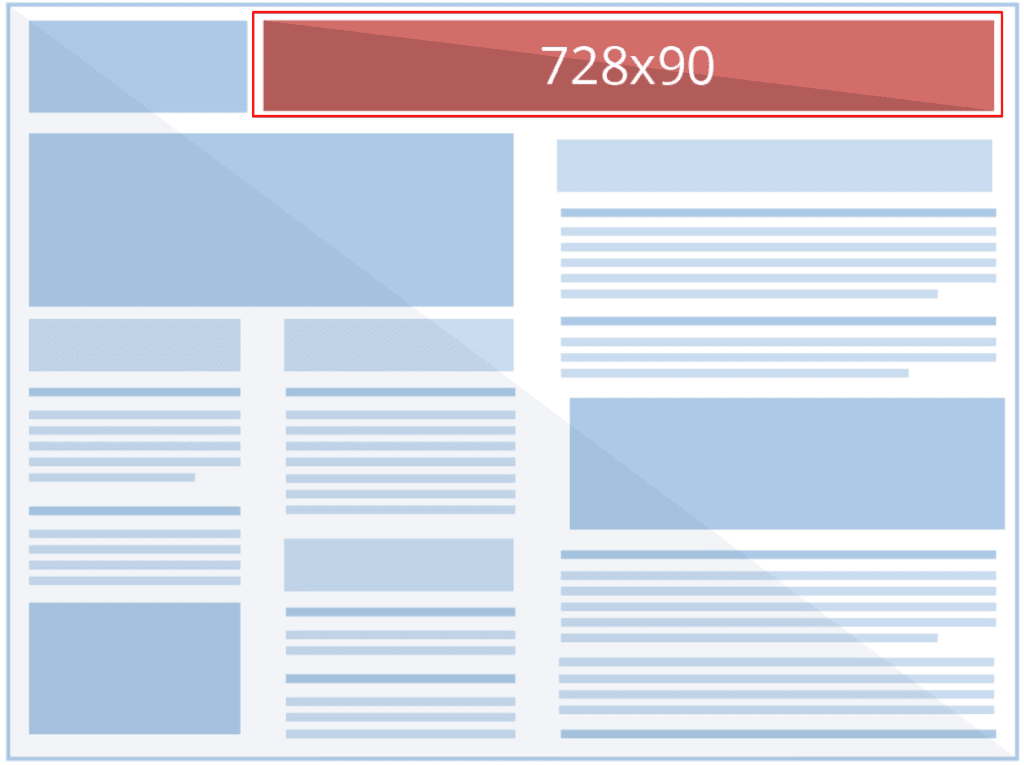
#3. Leaderboard (728×90 ad size)
This ad is usually set at the top of the page so that it is the first thing that web users see when they land On a page.
If you wish to get your ad in front of many people as possible, then this is a good option to consider, since it performs well, commanding the highest impressions.

#4. Half-page or large skyscraper (300×600 ad size)
The Half-page ad provides higher visibility due to its large size. It covers nearly half of the web page, which is suitable for better engagement.
This means that, as an advertiser, you have a lot more elbow room to get your message noticed. But this comes with the pressure of needing some creative inspiration to come up with stunning visuals that draw people in to click on your banner ad.


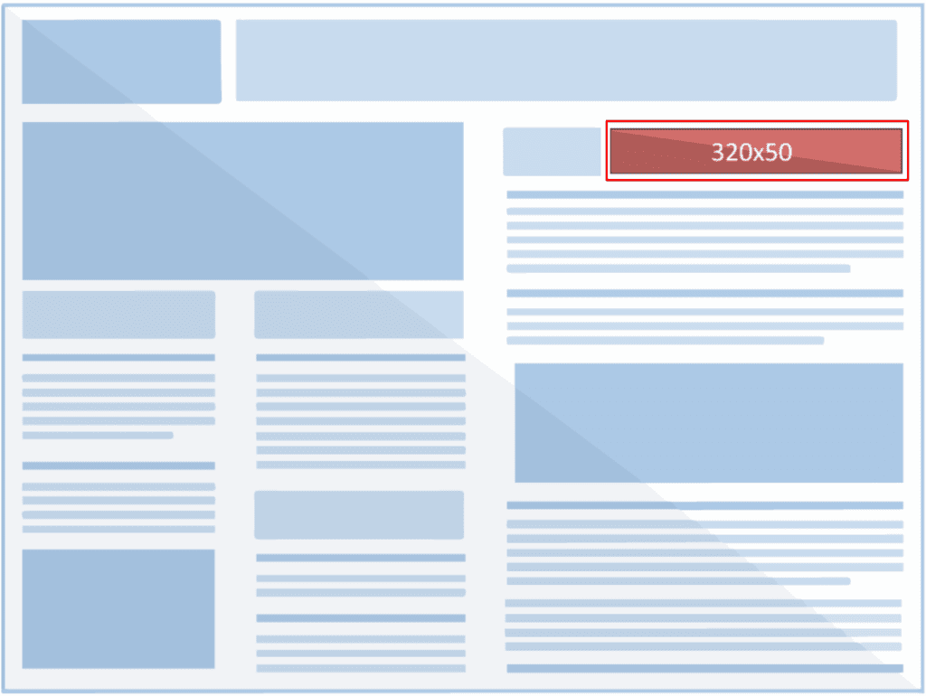
#5. Mobile leaderboard (320×50 ad size)
This banner ad size brings an optimum response from smartphone viewers only. This means this banner ad format is optimized for mobile devices only. Google doesn’t design the Mobile Leaderboard ads for desktop, tablet, or laptop screens.

Banner Ad Sizes For Social Media Platforms
Tip: Try to keep your profile picture consistent across all your social accounts to improve brand recognition, if you are going to involve more than one social media platform in your ad campaign.
#1. Instagram Image Sizes
Instagram is a platform that deals strictly with visuals and with all its users falling for only beautiful visuals alone, it would poor outing to put out sizes of banner ads that won’t stand out.
Using the right Instagram post size makes a huge difference.
Profile photo size: 110 x 110 pixels
Photo size: 1080 x 1080 pixels
Photo thumbnail: 161 x 161 pixels
Appear on the home page at 110 x 110 pixels
#2. Instagram Story Image Size
Your IG story video or photo will have to be 1080 pixels wide by 1920 pixels in height.
#3. YouTube Banner Sizes
Your YouTube channel art needs to grab the visitor’s attention and communicate what your channel is all about. So use this opportunity to create something original that will thrill your visitors.
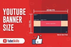
The excellent size for a YouTube channel art image is 2560px by 1440px.
The safe area that will display on all devices is the central area of 1546px by 423px. Keep any logos, text, or image focal points in this area.
Predominant file types are JPG, GIF, BMP, or PNG no larger than 6 MB.
Make sure you’re using an up-to-date version of your browser so you can upload files greater than 20 GB. The maximum file size you can upload to YouTube is 128 GB.

#4. LinkedIn Image Sizes
LinkedIn Pages are available on multiple devices and screen sizes. When updating your LinkedIn Page images, we recommend the following specifications.
Tip: We recommend testing your logo to make sure it displays correctly on both light and dark backgrounds.
Cover Image 1128 (w) x 191 (h) pixels 1128 (w) x 191 (h) pixels
Tip: We recommend uploading a high-quality image with limited text to ensure an optimal display on all devices and screen sizes. Our accepted image formats for uploads are PNG or JPEG.
Main Image 1128 (w) x 376 (h) pixels 1128 (w) x 376 (h) pixels
Custom Modules 502 (w) x 282 (h) pixels 502 (w) x 282 (h) pixels
Company Photos 264 (w) x 176 (h) pixels 900 (w) x 600 (h) pixels


#5. Twitter Image Sizes
As a leak, to make sure that your page stands out, your Twitter cover photo has to be larger and different from your profile photo.
Twitter Cover Photo: Twitter recommends a 3:1 aspect ratio, 1500px X 500px size, and a maximum file size of 5MB.
Twitter Profile photo: the standard aspect ratio of 2:1
Tweeted Images: The ideal image size and aspect ratios are 1200px X 675px and 16:9, respectively. The maximum file size is 5MB for photos and animated GIFs. You can go up to 15MB if you’re posting via their website.
Twitter Card Image Size: your Twitter card images should fit 1.91:1 or 1200px X 628px dimensions.
#6. Facebook Banner ad Sizes
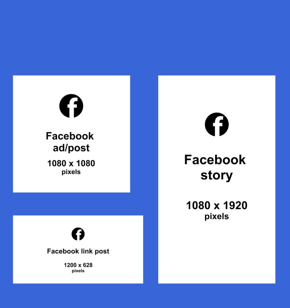
Facebook Event Image Sizes: Facebook event cover image size is 1200 x 628 pixels
Facebook groups cover photo size for desktop is 1640 x 662
Pixels For mobile is 1640 x 859 pixels
Facebook Stories Ads – 1080 x 1920
Facebook Feed Video Ads – 600 x 315

Why Does Banner Advertising Still Work?
Banner advertising does have the potential to send traffic to a website, and when the placement is done correctly, the likelihood of that visitor being interested in your products and services is high.
This is because they are instantly noticeable because of their size or color, which draws the eye to the ad placed.
In a busy area, a banner can be used to separate a business from the rest of the crowd. Large banners are typically used as tools for an announcement because of their attention-grabbing ability.
Best Practices for Effective Banner Advertising
#1. Use Catchy images to Draw your Audience Into Your Ad
An eye-catching banner ad combines several visual aspects ranging from the image or video itself to things as basic as the colors and fonts you choose.
#2. Use animation to overcome banner-blindness
Recent studies suggest that people now generally lose concentration after 8 seconds (A shorter attention span than that of your average goldfish).
This fact is even more striking when you consider banner blindness, which is when users subconsciously ignore banners or anything that seems like an ad on their mobile devices.
Persistent ads attempting to break through these boundaries via annoying animations can cause hostile feelings towards the brand amongst users.
When designing to capture attention, the most important thing to keep in mind is contextualizing the environment in which the ad is served.
#3. Offer free trials and other incentives
Most companies that use free trials say free trials account for up to 10% of new sales, according to a SaaS Metrics Report by Totango. Be like Disney for instance that offers new customers a free trial, relying on its content to keep them hooked.
#4. Spotlight your product
Give the advertised product the needed spotlight it deserves, without littering the page. This Nike ad works well chiefly because the brand avoids the urge to clutter it.
Instead of providing multiple tiny pictures of shoes and hoping that the viewer can find one that appeals, it sets one shoe in front of their eyes. The bright colors help too. The viewer can’t miss it.
#5. Inspire urgency
Creating a sense of urgency in the customer is a proven way to drive sales.
Consider this.
Offer Something People Want_Set a Deadline_Create Scarcity_Use the Right Words_Offer a Bonus_Incentive_Write Powerful Subject Lines for Your Emails,
#6. Offer Solution
Consumers have pain points and that is what takes them to the marketplace. Make sure your banner ad is designed to offer them the solution they seek, as offering a solution is going to make your ad a click magnet.
An ad that offers a solution is the only thing that makes sense to users, so when your banner ad promises them a solution, it inspires the existing users to upgrade, and those using other services or products to switch.
You must define clearly in your banner ad what you are providing to your customers. For example, if a strong feature of a business is that it has a 24-hour opening, spell it out clearly.
“We’re open 24 hours which means that you can get what you need when you need it, day or night.” This offers a significant solution to customers who may not need your service but are not sure night is the wrong time to contact you.
#7. Give your banner ads a professional look
Your ad will be seeking attention, and sloppiness leaves a bad impression. Don’t just throw something together. Take the time, and use ad-creation tools to earn your ads a stand-out place.
Conclusion
You’re ready. You know your display-ad basics, and practical and workable approaches to get started on sound footing.
So put your foot down and get to work. You know what banner ads are, the appropriate size that fits the different social media platforms and other platforms, and also where to place them.
You’re also equipped with techniques for success and recommendations to help you get the most out of every buck you hand over to the display networks.

