You might get by for a while with poor user experience (UX) if your product or service meets a need. People will tolerate a clunky website or app if it delivers what they want.
But once competition shows up, you’re at risk because you get kicked and forgotten in the dust. A better user experience will attract your customers, even the loyal ones will move away from you.
Without competitors, you can get away with a bad UX because people have no other options. But don’t kid yourself—you’re not the only one offering that product or service in town. You must provide a great user experience to keep your customers happy and loyal.
Now I know that sometimes it is hard to know if your UX is good or bad. That’s why I’m here to help you understand the difference between poor user experience vs great user experience. Stay close and learn.
Table of Contents
ToggleWhat Does Good User Experience Mean to you?

Here is what a good user experience means to me:
#1. SIMPLICITY
Simplicity is the cornerstone of good UX design. It is all about making the user’s interaction with your website as effortless as possible. When a site is simple, users can achieve their goals without unnecessary steps or confusion.
This leads to higher satisfaction and a greater likelihood of returning to your website. Let’s look at why simplicity is so important and how it can be achieved.
Example: Zara’s Website
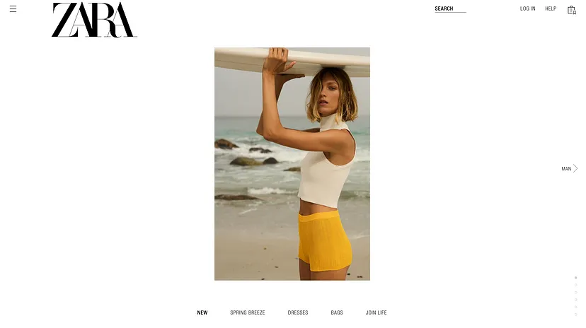
Zara’s website is a prime example of simplicity in action. Here’s how they do it:
#1. Clean Layout: The design is minimalistic, with plenty of white space that makes the content stand out. This reduces cognitive load, allowing users to focus on what matters.
#2. Intuitive Navigation: Zara’s website has a straightforward menu structure that guides users seamlessly through different categories. Whether you’re looking for men’s, women’s, or children’s clothing, you can find it quickly.
#3. Easy Access to Products: Product pages are designed to provide all necessary information at a glance, with high-quality images, clear pricing, and options to add items to the cart or wish list with a single click.
#4. Streamlined Checkout Process: Zara’s checkout process is simple and quick, reducing the friction that can often lead to cart abandonment. Users can review their cart, enter shipping information, and complete their purchase in just a few steps.
#2. BALANCES USABILITY
Simplicity doesn’t mean sacrificing functionality. A good UX design balances simplicity with usability, ensuring that all necessary features are easily accessible. This means intuitive navigation, clear calls to action, and straightforward processes for tasks like making a purchase or signing up for a newsletter.
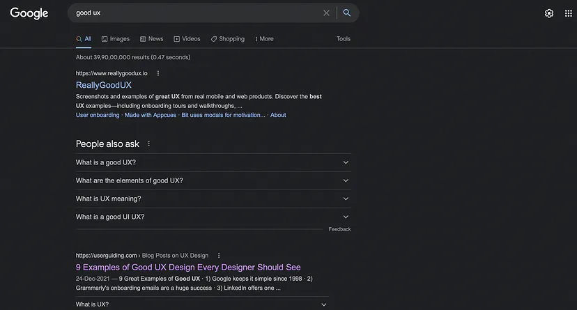
For Example: Google Search, a good balance of simple and usable system. Giving user the ease and comfort of interaction, which them easily accomplishing the task.
#3. AESTHETICS
Users make a snap judgment about your website, app, or product in just 40-50 milliseconds based on its visual appeal. This means that the look and feel of your digital platform are crucial for creating a good user experience.
Example: Myntra’s Website

Take Myntra’s website as an example. It’s visually pleasing and adheres to the aesthetic-usability principle, meaning it’s not only attractive but also easy to use.
The design is clean, the colors are well-chosen, and the layout is intuitive, making it easy for users to navigate and find what they are looking for.
Why Visual Aesthetics Matter?
#1. First Impressions: Users form an immediate opinion about your site, so strong visual appeal is essential for a positive first impression.
#2. Engagement: A beautiful design draws users in, encouraging them to spend more time on your site.
#3. Trust and Credibility: A professional-looking site builds trust and credibility with your audience.
#4. User Satisfaction: A visually pleasing site contributes to overall user satisfaction, making visitors more likely to return.
What Are Common Examples Of Good User Experience?
#1. Disney Plus (Landing Page)
Once you log in to Disney+, you’re greeted with a large, featured area at the top showcasing the latest and most popular content. Below that, you’ll find horizontal rows of categories and personalized recommendations. There are logos for Disney’s five main brands — Disney, Pixar, Marvel, Star Wars, and National Geographic. Each logo leads you to a collection of movies and shows from that brand.
Why It’s a Good User Experience
#1. Intuitive Layout: The layout is simple and easy to navigate. The featured area at the top grabs your attention right away.
#2. Personalized Recommendations: The horizontal rows are tailored to your tastes, helping you find what you like without endless searching.
#3. Brand Collections: Clicking on the logos takes you directly to content from your favorite brands, saving you time and effort.
#4. Visual Appeal: The design is visually engaging with high-quality images and a clean, organized look.
#5. Ease of Use: Everything is easy to find and access, making the whole experience smooth and enjoyable.
Disney+ ensures you spend more time enjoying movies and shows rather than searching for them, making it a top-notch user experience.
#2. Apple’s Product comparison
The compare product feature on Apple’s website is a standout element that contributes to its great user experience.
It lets users pick three to four items from a product category, like iPhones, and compare them side by side. This feature saves users time and effort, eliminating the need to check products repeatedly for comparison.
Why It’s a Good User Experience
#1. User-Friendly Interface: The comparison tool is easy to use, allowing users to quickly add products for a side-by-side view.
#2. Efficient Decision-Making: By seeing all the specs and features laid out next to each other, users can make informed decisions faster.
#3. Time-Saving: Users don’t have to navigate back and forth between product pages, which streamlines the shopping process.
#4. Clear Information: Important details and differences between products are highlighted, making it easier for users to understand what they’re getting.
This feature enhances the overall UX by making product comparison straightforward, efficient, and informative, helping users find the best product for their needs without hassle.
#4. Google’s search results
One of the best search engine interfaces strikes the perfect balance between simplicity, usability, and minimalistic design. It lets users see everything at a glance without having to open each link.
What Makes It a Good User Experience:
#1. Simplicity: The design is clean and straightforward, making it easy for users to navigate without any distractions.
#2. Usability: The interface is user-friendly, with intuitive features that make searching and finding information effortless.
#3. Minimalistic Design: By keeping the design minimal, it avoids clutter and ensures that only the most important elements are highlighted.
#4. Quick Overview: Users can get a snapshot of the search results quickly, saving time and effort. They don’t need to click on each link to get the information they need.
#5. Relevant Information: The results are presented in a way that the most relevant information is easily accessible, enhancing the overall user experience.
#6. Visual Hierarchy: The use of fonts, colors, and spacing helps guide users’ eyes to the most important parts of the page, making it easier to find what they’re looking for.
When you focus on these elements, the search engine provides a great user experience, ensuring users can find what they need quickly and easily.
#4. Twitter’s Home page
Twitter, one of the major social media platforms, has tons of users who use it regularly. They’ve designed their homepage to let users reach everything with just a single click (or minimal clicks). Here’s why this makes for a great user experience:
Why Twitter’s UX is Great:
#1. Intuitive Navigation:
Minimal Clicks: Users can access their timeline, notifications, messages, and profile with just one or two clicks.
Clear Layout: Everything is organized logically, making it easy to find what you need.
#2. Responsive Design:
Mobile-Friendly: Whether you’re on a desktop, tablet, or smartphone, Twitter adapts to provide a seamless experience.
Consistent Experience: The design and functionality remain consistent across devices, so users don’t have to relearn anything.
#3. Real-Time Updates:
Instant Notifications: Users receive real-time updates on mentions, likes, and retweets, keeping them engaged and informed.
Live Feeds: The timeline updates automatically, so users always see the latest tweets without refreshing.
#4. Personalized Content
Relevant Suggestions: Twitter uses algorithms to suggest tweets, trends, and accounts based on user behavior, making the experience more personalized.
Tailored Ads: Advertisements are targeted, making them more relevant and less intrusive.
#5. Easy Interaction:
Engagement Tools: Retweets, likes, comments, and direct messages are all just a click away, making interaction simple and straightforward.
Hashtags and Mentions: These features make it easy to join conversations and connect with others.
What Makes Twitter’s UX Good and outstanding:
#1. User-Centric Design: Twitter prioritizes user needs by providing easy access to core features and minimizing the effort required to navigate the platform.
#2. Efficiency: By reducing the number of clicks needed to reach different parts of the site, Twitter saves users’ time and effort, enhancing their overall experience.
#3. Consistency: The platform offers a consistent user experience across all devices, ensuring that users can switch between their phone and computer without any hassle.
#4. Engagement: Real-time updates and personalized content keep users engaged, making the platform sticky and encouraging regular use.
What Does Are Some Examples Of Poor User Experience?
#1. WhatsApp deleted message feature

The purpose of the “Delete for Everyone” feature in WhatsApp is to help users who accidentally send a message to the wrong person.
While WhatsApp hides the content of the deleted message, it still shows a “message deleted” notification to both the sender and the recipient.
This notification defeats the purpose because it alerts the recipient that a message was deleted, which can cause confusion, suspicion or curiosity.
Why It’s a Poor User Experience
#1. Incomplete Deletion: The “message deleted” notification means the message isn’t fully erased, which can frustrate users who want to correct their mistake without drawing attention to it.
#2. User Anxiety: Knowing that the recipient sees the “message deleted” alert can cause anxiety or embarrassment for the sender.
#3. Lack of Privacy: The feature fails to provide a seamless way to correct mistakes privately, which is what users expect.
To improve this experience, WhatsApp could consider removing the notification altogether or finding a more discreet way to handle message deletion. This would align better with user expectations and provide a smoother, less stressful experience.
#2. Overly Complex Passwords
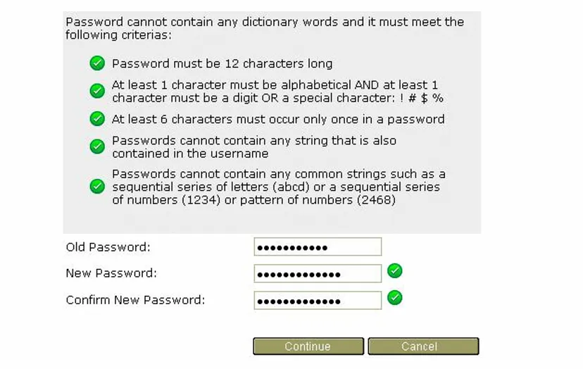
Passwords are meant to be safe and secure, protecting against hackers and unauthorized access. However, the experience becomes frustrating when the password requirements are overly complex. This can significantly reduce the quality of the user experience (UX).
Why Overly Complex Passwords Create Poor UX:
#1. User Frustration: When users are forced to create passwords with a mix of uppercase letters, lowercase letters, numbers, special characters, and a minimum length, it becomes a hassle. This complexity can lead to frustration, as users struggle to remember these complicated passwords.
#2. Password Fatigue: Constantly having to come up with unique, complex passwords for different sites leads to password fatigue. Users may resort to writing them down or using simple, easily guessable variations, which defeats the purpose of having secure passwords.
#3. High Abandonment Rates: When the process of creating a password is too difficult, users might abandon the registration process altogether. This can result in lost sign-ups and decreased user engagement.
#4. Reset Hassles: Complex passwords are often forgotten, leading to frequent password reset requests. This adds an extra step for users and increases the workload for customer support teams.
What Makes It a Poor User Experience:
#1. Confusing Requirements: Users may find it hard to remember all the rules for creating a password, such as the need for special characters, numbers, and a mix of cases.
#2. Time-Consuming: Creating and remembering a complex password takes extra time, making the sign-up or login process longer and more tedious.
#3. Inconvenience: Users might need to reset their passwords often, which is inconvenient and disrupts their interaction with the site or app.
To improve UX, it’s important to balance security with simplicity. Implementing solutions like password managers, single sign-on (SSO), and two-factor authentication (2FA) can enhance security without compromising the user experience. By simplifying password requirements and offering alternative security measures, you can ensure that users feel both secure and satisfied.
#3. eBay’s complex product details
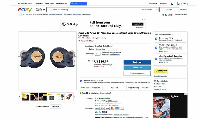
When buying from an online marketplace like eBay, you want to make an informed decision. However, eBay’s attempt to provide tons of information on its product pages can lead to information overload eventually leading to a poor user experience.
Why This is a Poor User Experience:
#1. Too Much Information: Instead of helping, too much data can overwhelm you. You might struggle to find the key details you need.
#2. Cluttered Layout: With so many details crammed into the page, it becomes cluttered. This makes it hard to focus on what’s important.
#3. Difficult Navigation: You might have to scroll through endless text and specs to find what you’re looking for.
#4. Decision Fatigue: Being bombarded with information can make it harder to make a decision, leading to frustration or even abandonment.
What Makes It a Poor User Experience:
#1. Overwhelming Details: When product pages are overloaded with specifications, reviews, and other information, it can be hard to process everything.
#2. Lack of Clarity: Key information can get lost in the clutter, making it difficult to quickly understand the most important aspects of the product.
#3. User Frustration: If you can’t easily find the details you need, you may become frustrated and leave the site without making a purchase.
#4. Inconsistent Presentation: When information is presented inconsistently, it can be confusing and make the site feel unreliable.
eBay needs to streamline its product pages, presenting only the most essential information clearly and concisely, to improve the user experience and help you make informed decisions without feeling overwhelmed.
#4. IMDb’s Layout
IMDb has redesigned its homepage for a sleeker user experience, but some pages still have the old, outdated design with noticeable UX issues.
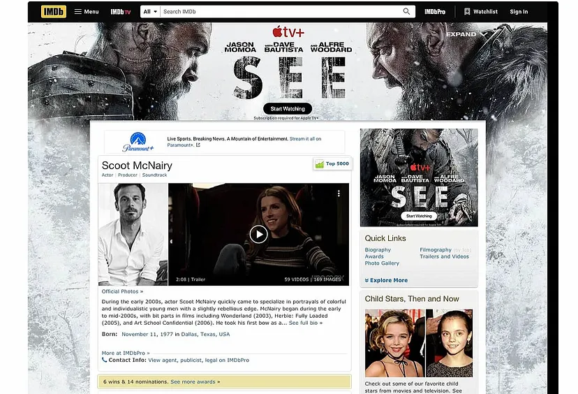
These pages suffer from cluttered layouts, minimal whitespace, small font sizes, and an overload of ads and content. This makes it hard for visitors to achieve their goals. Here’s why and what makes it a poor user experience:
Poor User Experience Factors:
#1. Cluttered Layout: Too much content and ads crammed together, making the page feel overwhelming and difficult to navigate.
#2. Minimal Whitespace: Lack of spacing between elements makes the page look dense and uninviting, affecting readability.
#3. Small Fonts: Small text is hard to read, causing strain and frustration for users.
#4. Excessive Ads: Too many ads distract users from the main content and disrupt their browsing experience.
Why It’s a Poor User Experience:
#1. Navigation Difficulty: Users struggle to find the information they need due to the cluttered design.
#2. Visual Overload: The lack of whitespace and small fonts make the page visually overwhelming, leading to a poor reading experience.
#3. Increased Frustration: Users get frustrated with excessive ads interrupting their browsing, leading to a negative overall experience.
#4. Accessibility Issues: Small fonts and cluttered layouts are not user-friendly, especially for those with visual impairments.
To improve the user experience, IMDb should ensure a consistent design across all pages, incorporating more whitespace, larger fonts, and fewer ads to create a cleaner, more navigable, and user-friendly interface.
There’s a law in UX that says, “Users often perceive aesthetically pleasing design as more usable.” This means that while good visuals are important, they shouldn’t take priority over usability.
Your designs might look great, but visually appealing designs aren’t always user-friendly. We need to balance aesthetics and usability to create a good user experience (UX). This means ensuring that while your website or app looks nice, it also functions smoothly and meets user needs effectively.
Conclusion
In conclusion, balancing aesthetics and usability is key to creating a great user experience (UX). While an appealing design can attract users initially, it’s the functionality and ease of use that will keep them coming back.
A good UX design should prioritize simplicity, ensuring that users can navigate your website or app effortlessly. Integrating intuitive navigation, clear calls to action, and streamlined processes are essential for meeting user needs effectively.
Remember, even the most visually stunning design won’t retain users if it’s not user-friendly. When you combine a clean, attractive layout with practical, easy-to-use features, you can enhance user satisfaction and loyalty. Always aim for a harmonious blend of aesthetics and usability to provide a seamless, enjoyable experience that keeps your audience engaged and coming back for more.


