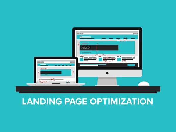
Landing pages are best described as online marketing tools that are essential for every business, blogger, or any other online marketing organization. Converting visitors into leads is key and must be seen as the first step required of every blogger.
This is done in order to establish a good rapport between the organization and a prospective buyer.
This article titled landing pages: The beginners guide with examples is written to aid your understanding of the need to write quality landing pages for your business and also how best to utilize them for optimal conversion.
#1. What is the landing page?
Landing pages are static pages that serve as a door to the website. These pages are usually ones in customers “land on” as a result of the original action of clicking on an ad, and marketing promotion, marketing email, or marketing promotion. Also referred to as a “lead capture page” or “destination page”.
A landing page is simply a page that serves as a door to the website. These pages are designed on your website in a way that customers click on using a call to action (CTA) for an offer.
This action could be clicking on an ad, marketing promotion, marketing email, product, free guide, coupon, etc, while the call to action (CTA) could be the likes of a Google ad on the SERP, or newsletter sign-up on your homepage.
They are indeed the best for digital ad campaigns, but they can also be useful tools when you connect a QR code on print marketing materials to a specific page.
The landing page is basically aimed at converting visitors. It becomes pertinent that every blogger should deem it fit to have this essential tool at their disposal for all types of marketing campaigns.
In simple terms, it could be referred to as the lead capture page or destination page. A landing page is a form designed specifically to offer and provides more details the person needs in order to make a confident decision.
#2. Why Use Landing Pages?
No doubt, landing pages are the most effective lead conversion tool, which is why, when you are done with your content creation by building your brand and creating a website that represents it.
It is important you make sure that all of your great work put together is converted into sales and, at this point, the best thing to do is by using a landing page.
A landing page becomes necessary since it is just a perfect way to drive traffic, improve your SEO, as well, build your brand. Don’t forget, this must form part of an effective PPC strategy since they’re designed to improve conversion, which is ultimately one of your most important metrics.
Records show that approximately 68% of B2B businesses use landing pages in order to generate leads for future conversion. Though 44% of these clicks are directed toward home pages, which is not a good strategy. Landing pages lead customers to a specific product, service, or offer and encourage them to take action. This is your opportunity to create conversions and build your customer base.
#3. What Makes a Good Landing Page?
Haven agreed that landing pages are lead capture pages and destination pages. It is good that you take advantage of it by sending your potential customers to a page that will let them feel satisfied with whatever offer you have for them.
Don’t forget, your landing pages stand a chance of capturing the attention of customers for a long period of time. A good landing page should have the following attributes:
1. Offer customers exactly what you have in stock. Every click by a customer counts since they are clicking for a purpose. Always try as much as possible to ensure what they click at is what they end up having. Anything contrary will give a negative impression on your site, product and services.
Avoid being detailed regarding the history of your company, but, rather, your landing page should serve a function of the products and services or offers that could encourage them to take action.
2. It should not serve as a form of distraction but as a focus. The essence of the landing page is to get users what they want after they have completed the registration. That is to say, your landing page must be rich in content and must serve the said purpose.
3. The forms should not be unapproachable. Try as much as possible to keep the content of your landing page to be as simple and short. This is to ensure visitors don’t find the forms too long, because such could be intimidating and, as such, visitors
may be discouraged to move on, rather than take advantage of whatever opportunity you are offering to ensure visitors keep moving on and on.
If you simply can’t shorten your form, break it into steps, and let the user see exactly where they are in the process. For example, listing their name and address may be step one of four.
4. They speak to a specific audience. Being specific could help you to target specific consumers through customized campaigns and this has to do with segmenting your customer.
If you have a base that’s drawn to a particular offer, such as an eBook or discount, your landing page can serve as a built-in segmentation device, allowing you to nurture these leads effectively going forward.
5. They collect specific information about your prospective customers. It is obvious that you must speak for a targeted audience. Though, even if you end up getting the right crowd, remember it is difficult to convert the same when you failed to collect the right information.
Therefore, while collecting demographic data which includes a name and email address, it is also important to give some idea of why a person clicked and what their long-term connection to your company might be.
6. They provide a thank you. Do ensure your landing page should be followed up with a thank you. This is a sure way of assuring the consumer that they have completed the registration process.
7. This gives users access to other marketing channels. Once a customer likes your offer, you are required to provide links to other offers, your social media profiles, or an email list sign-up.
This process has become necessary only if you want to improve conversions. Today we live in a digital world and so, is what the business will do, going forward with a digital marketing campaign is just one of the best investments that you make for your business.
Striving to excel in digital marketing entails building a formidable digital marketing toolbox that must also include landing pages and this is the only way you and your customers will reap the benefits.
#4. Landing Page vs. Website Homepage
Many may not find landing pages interesting due to their perception that the purpose is to attract traffic and that their homepage can offer the same. However, there is no denying the fact, that getting traffic using a homepage can not measure the amount of traffic a landing page offers.
There are some businesses that can create landing pages using their website builder (like Squarespace) or content management system (like WordPress). With this, the landing page is a page on your website and it lives in your website’s domain.
The homepage is a page that contains a lot of information and invites users to navigate to a variety of different locations. In a nutshell, if a visitor reaches your homepage with one specific goal in mind, they might be turned off if they have to look through several additional services and product options first. The homepage’s main objective is to direct users to other pages where they will find the information they want.
Landing pages eliminate the intermediary step by being the page the user wants – and stating as much in no uncertain terms.
Your homepage is general, whereas the landing page is focused and specific. While the homepage draws visitors further into your website by presenting all the options your business has to offer, a landing page offers one simple and clear call to action.
#5. Types of landing pages
There are several types of landing pages, and these different kinds of landing pages serve differently. While some are event landing pages, others are webinar landing pages, and product landing pages, newsletter signup landing pages are inclusive of a host of others. However, in all of these, we can confidently classify landing pages into two categories, which are: lead generation landing pages and click-through landing pages.
Lead Generation Landing Page
Also known as a lead-capture landing page, this basically intends to collect leads by way of a data capture form. These pages are resourceful and are often used in the middle of the sales funnel. This explains a situation where customers are on the verge of making a decision regarding your offers on whether to convert or walk away.
At this point, you have to deal decisively with the reward and request. While the reward is about the specific offer you are promoting so as to capture leads, the request in turn becomes the information you ask for in your form.
It therefore means, both the request and the reward should be sensitive, believing that whatever you are promoting must be worth the customer offering you their details and adding them to your mailing list.
Click-Through Landing Page
The click-through landing page does not necessarily require a form but rather serves as an intermediary between your advert and the page to which you wish to direct your customers when they click on the CTA button.
In most cases, it is used to link an ad to a shopping cart and this requires only a simple and short explanation of what the visitor has found by clicking through landing pages that are used for bottom-funnel offers or sales, where the second step is the account creation portal, app store, or checkout windows.
Squeeze Page
A squeeze page is a page that is also used to collect data. However, this is used near the top of the sales funnel with the aim of gathering email addresses to add potential leads to a general mailing list.
A squeeze page is short with basic landing pages that come with bold headlines and little content. A clear call to action of this kind compels customers as to what is expected from the click-through.
As short as you can make the form, it must have both a link to take the reader to the next step and an exit option if the visitor does not wish to proceed.
Sales Page
This is considered one of the most difficult pages to design due to its complex nature of not just prospecting for leads but making it convincing for customers to take action and this should be used at the bottom of the funnel.
While creating this page from the copy to the design, get a better understanding of your customers’ needs and their position in the sales journey and this is the only way you can sell, but failure to do so will result in turning your client away, or you could undersell and lose the sale anyway. Therefore, inculcating good old-fashioned salesmanship becomes an advantage in your design and communication tactics.
While other types of landing pages don’t require lengthy forms, here the length of the page depends very much on your product and how much you need to say to explain its value to your customers.
Whether short or long as the form may be, there is every need to clearly demonstrate this value, with the aim of getting them to click that button and make the purchase.
Infomercial
As old as you may think infomercials are, don’t forget it add value to late-night television advertising, which is why many businesses admire it and incorporate their sales techniques as one of their digital strategies in the aspect of specialized landing pages.
Infomercial landing pages tell your readers a long, elaborate story, using copy that recalls the emotive and excitable mannerisms of those late-night sales masters. The aim is to keep readers scrolling and get them to commit to a purchase.
Viral Landing Pages
These pages are majorly intended to create brand awareness. These usually contain links to a company website or other web page and are usually presented subtly and discreetly too.
Though the content is the main thing, it is informative and this is enough to engage a reader and get them to share the page, together with the ability to share the page using social media. The content could be written copy or could involve videos, images, or even games.
#6. What You Need Before Creating a Landing Page
There are bases that can’t be ignored while trying to create a landing page that can be impactful. This is to say, you must make sure you’ve done all of the necessary homework as regards research for an effective landing page creation.
The following, therefore, are what you need to do before you get to work on the landing page itself.
The Buyer Persona(s)
This is about getting to know what your ideal customer wants. This can be done using market research on current customer data. In the end, it gives you clear insight into your customers’ behaviors and how they think, which will allow you to develop the most valuable content you can for them.
At this point, when you create your landing page, the essence is to target just one of your personas in case you have more than one. This is to avoid a situation of having the content on your landing page for multiple personas since it will have a negative effect and will decrease the odds of conversion.
Trust me, when you target one persona, your efforts will be much more focused and rewarded with high chances of increasing your odds of conversion.
The Offer
Simply put, it could be something created to provide value to an organization’s website visitors. The offer here could mean a free e-book, webinar, tip sheet, comparison guide, or anything else that can be downloadable and as well be information regarding your industry.
The Buyer’s Journey
This explains how a prospective buyer goes through his/her research process in order to make a purchase. This journey has three stages and it includes the awareness stage, the consideration stage, and the decision stage.
Therefore, it would be wise to create different types of content for each specific stage of the journey in order to help people move from one stage to another and this can thus be explained further:
#7. How to optimize your landing pages for conversion
Going through what is previously discussed in relation to what is about to be discussed will help you have a good landing page that will be tailored towards high conversions. Here’s how to optimize your landing pages for greater conversion:
1. One goal, one CTA
Landing pages should be able to center on just a target goal and CTA and this is the best option to go, since additional links on the page like navigation links, footer links, or social share buttons are only considered to serve as secondary CTAs. This, therefore, will reduce the chances of the user taking the action you want them to take.
The truth is when your landing page is lengthy, multiple CTAs are then placed throughout all points leading to the same form or destination. With this, the main navigation can be removed from the page, thereby leaving the user with just one option.
2. It should be spotless and organized.
As earlier stated, the information on your landing page should be prioritized so that the most important elements are seen at all times when the user visits, even before having to scroll, like the CTA, key benefit(s), and value proposition.
Other information should be presented in an organized manner with a lot of visual elements to balance it out. If you’re optimizing for SEO, consider using tab, drop-down, or accordion-style functionality to include additional copy without cluttering up the page.
3. Use trust signals
This type of landing page conversion comes with different types, which include:
- Customer Quotes: Such quotes include testimonials and case studies, and customer reviews.
- Influencer endorsements: Add the logo of the brand that uses your product or service and quotes from influencers.
- Awards and recognition: Having a partnership or certificate badge from a third party speaks positively about your brand and also builds trust.
4. QA your landing pages
For you to have an effective landing page live, try to read the page in full and also fill out the form and always make the thank you page loads and the offer is delivered. In case you have tracking set up, be sure the information is contained in your CRM or database and this process could be repeated via mobile devices.
5. Run A/B tests
Running A/B tests is important because different components that aid a landing page have influences on the behavior of the users. These factors could be the headline, the image used, the button colors, and even the button copy all have an impact.
Therefore, testing your landing pages becomes necessary, and it should be done on a regular basis in order to ascertain what is working and not working.
#8. Examples of great landing pages
Regardless of what your business is selling or the conversion action you hope to bring to bear, it’s helpful that you get inspired only if you see what other great landing pages look like.
However, there’s no one “right” way of designing a landing page. It is advisable to check out the different examples of the different industries for different stages of the buying process.
We have painstakingly selected some of the best landing page examples that can make a successful landing page that will attract conversions.
1. CallRail landing page example-Free trial
This is one of the great landing page examples I have tumbled. It has some unique features that make it great when properly used. It can result in a conversion.
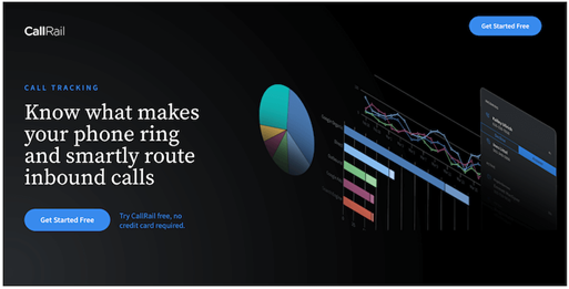
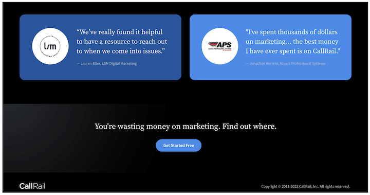
The design of CallRail is clean with only 26 words that are visible above the fold, 6 of which are the 2 CTA buttons. The graph design is indeed colorful, making it look amazing and attractive too.
Another characteristic that makes CallRail great is the compelling headline. Knowing what makes your phone ring and smartly route inbound calls clearly defines what it does and how beneficial it is to the user.
More importantly, too, there is a trust badge that signifies there are more than 180,000 businesses that trusted in their services, indicating three badges and testimonial quotes from real customers.
This landing page boosts clear copy where CallRail uses cards to explain its features and benefits using short copy.
Due to the long nature of this landing page, the CTA is repeated at the bottom of the page using a CTA phrase that reads ‘you’re wasting money on marketing. Find out where.
2. Wix
Wix another landing page with a creative playground with so much magnificent and fascinating digital displays down the page. This landing page is not disrupted, but rather it’s cautiously designed with white space and clear text.
We love the use of design to emphasize certain touchpoints on the page. For instance, the mountain’s peak in the illustration points to the main CTA, encouraging visitors to get started.
3. SaaS landing page example – Loomly
My adventure had taken me to click on a Google ad that appeared for social media software and I landed on Loomly’s click-through landing page with its intriguing features.
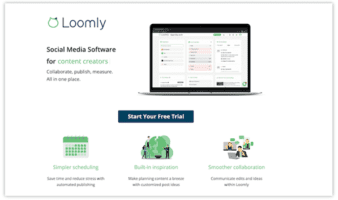
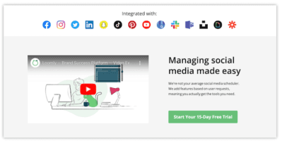
- Targeted messaging: Though the headline of this landing page may not be appealing, trust me it reads “Social Media Software,” thereby having a direct bearing on the query that ends up capturing the appearance of the ad.
This is indeed a great example of designing its message since it is a brand management platform.
- Clean design: This landing page is clean, just like CallRail. Additionally, this landing page has only one action and you can start a free trial using multiple buttons, which in turn could lead to the free trial signup form.
- Video: One great feature of this landing page is the video provision that it has. Adding video to landing pages can increase conversions by 86%.
- Trust badges: It boosts testimonial quotes from customers and additionally badges for awards from G2, Capterra, and Source Forge
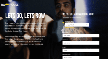
4. Row House
This landing page design is super shiny with a bonus that comes with its autoplay video in the background. Its movement is another fascinating attribute that comes with it. This movement shows a video of people working out of Row House which gives a resounding introduction to the brand.
Using this great kind of landing page will not only suit your brand but will entice visitors with a video component, thereby making the difference between passive and active engagement.
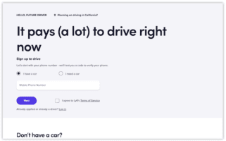
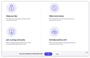
5. Signup landing page example – Lyft
This is one of the simple and clean designs for the landing page of Lyft. The following are the attributes that make it simple and clean.
- Notable form: The design of this landing page form is simple and clean. You can easily locate it at the top right side with just one field to accommodate the user’s mobile number. Though there are additional steps to the form, more notable is the way it’s been designed to resist and reduce friction and barriers to entry.
- The headline image size: The headline serves as a pointer in the absence of any image that will convey useful information: “It pays (a lot) to drive right now.”
- Information hierarchy: “Don’t have a car?” as you can see, this information is placed above the fold and strategically too, so as to prevent drop-off from visitors who exit with the thought they can’t drive without a car. This is necessary information and it is presented in a way that is not covering up the page.
- Scroll-triggered floating bar: You can find a lot of content on this page but with a floating bar that appears after a certain point of scrolling.
6. Sunbasket
Every landing page is designed bearing in mind the competitive nature and Sunbasket landing page design is not exceptional either. This landing page is designed to compare its meal delivery service to its main competitor, Blue Apron.
When you scroll down the page, there is a table displaying Sunbasket’s features which surpass those of Blue Apron.
To be competitive, while comparing your products or services to another, try as much as possible to show how and why yours is the best amongst others. This indeed is a smart way to provide “evidence” to potential customers as to why they should choose you.

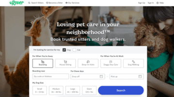
7. Rover
Rover is an on-demand-per-care service that is out to ensure trust exists between them and customers. It is always panicking when you put your pet in someone’s hand and, as a result of a fear factor, the Rover landing page is designed to accommodate this, since it leans on social proof to build trust with visitors. The landing page includes testimonials from real clients and a copy of its “Rover Guarantee” and 24/7 support. Of course, the cute pictures of animals help too.
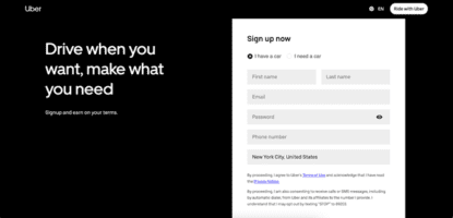
8. Uber
There is no disputing the fact that cyberspace is crowded with so much information. Creating a skim-able landing page becomes crucial, just as you can see from Uber.
This landing page features a black-and-white color scheme, short and easily-digestible sentences, and a simple form. The combination of these elements results in a professional and approachable page.
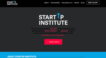
9. Startup Institute
Startup Institute has clearly defined what will happen after you apply by listing a Q&A right beside the form. The essence is to prompt some visitors to say, “They read my mind!”
It is obvious that many visitors to your website won’t hand over their personal information without knowing what they’re going to get in return.
Therefore, to avoid seeing visitors refusing to fill out a form, use your landing page to meet the expectations. This is indeed a sure way to clear the air, and can also weed out the people who don’t take your content, product, or service seriously.
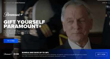
10. Paramount Plus
Paramount plus landing page is indeed comprehensive in its design. Look at how visually appealing, and interactive it is and also offers scannable yet descriptive headers like Peak Streaming, Peak Originals, and Peak Family Team. Plus, the background makes each fold look slightly different, creating a captivating scrolling experience.
The landing page also features a repeatable CTA (“Try It Free”) and several strategically-placed content offers, culminating in multiple touchpoints for visitors to convert.
Conclusion
Landing page as we agreed to a forum where bloggers or other online related marketers establish a good rapport with prospective buyers using the above-discussed guidelines. To achieve this, there is every need to constantly test and review the results so as improve your landing pages.
It is seemingly clear that you can start working on your landing pages so as convert those users and in the end, you can earn big.