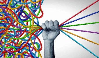
Banner ads are literally everywhere online. You see them on blogs, news sites, YouTube, and social media feeds. But here’s the truth — most of them go unnoticed. People scroll past them without even blinking. So, if you really want your ads to grab attention and actually get people to click, you need to learn how to design banner ads that get clicks – not just pretty ones, but powerful ones that make people stop, look, and take action.
The key isn’t about filling your banner with too many words or flashy colors. It’s about balance -clean design, strong visuals, and a message that speaks directly to your audience. When you design banner ads that get clicks, you’re not just creating something to look nice – you’re building a tiny, attention-grabbing story that makes people curious enough to know more.
Think of your banner ad like a friendly invitation. It should clearly tell people what they’ll get if they click – maybe a discount, a solution, or a freebie. Use bright but not harsh colors, easy-to-read fonts, and a bold call-to-action button (like “Shop Now,” “Learn More,” or “Get Started”). The goal is to make it impossible to ignore.
Over the years, we’ve learned that even the smallest details -like using the right image, the perfect color contrast, or a short and catchy headline – can double or even triple your clicks. That’s why we’re sharing some of our best banner ad design tips and examples from our own portfolio, so you can see exactly what works in real life.
In this guide, we’ll walk you through everything you need to know – from choosing the right layout and colors to writing irresistible ad copy – so you can start creating banners that don’t just exist online but actually perform.
Great Ways to to Design Banner Ads that Get Clicks
#1. Success Is in Simplicity
When it comes to learning how to design banner ads that get clicks, the secret ingredient is simplicity. Most people will only glance at your banner ad for about one second — yes, just one! That means your ad has to work fast. You don’t have time for cluttered text, confusing images, or fancy effects that make people stop and squint.
If you really want to design banner ads that get clicks, keep your message short, clear, and easy to understand. Think of it like this — your ad should speak to someone even if they’re just scrolling by in a hurry. Use clean, high-quality graphics that instantly tell your story. Your headline should be big enough to grab attention, and your call-to-action (like “Shop Now” or “Try Free”) should stand out boldly.
The goal is to make your ad so simple that anyone — even a ten-year-old — can look at it and know exactly what to do next. Too many colors, fonts, or images will only distract your audience. Instead, focus on one strong image, a catchy message, and one clear action button.
Remember: less is more. A clean and focused banner ad doesn’t just look professional — it’s easier on the eyes, faster to understand, and far more likely to get that click you’re aiming for.
#2. Showcase the Product
If you want to design banner ads that get clicks, one golden rule is this – let your product shine. People won’t click on what they don’t understand or can’t see clearly. So, whether you’re selling a physical item like a shoe, phone, or snack, make sure it’s right there in the spotlight. Your audience should know exactly what they’re getting the moment their eyes land on your banner.
Use clear, high-quality photos that make your product look irresistible. Don’t hide it behind too much text or clutter — make it the hero of your ad. Remember, people scroll fast, so you want them to instantly connect the image with the offer.
Now, if your product is digital – say, an online course, app, or service – it’s a little different. You might not have a physical image to display, but that’s okay. The trick to design banner ads that get clicks in this case is to show the benefit. Highlight what problem your product solves or how it makes life easier. For example, instead of showing an app’s interface, you can use text like “Save 5 hours a week” or “Grow your sales faster.”
Pair that with a bold, simple call-to-action (CTA) like “Learn More”, “Get Started”, or “Try for Free.” This helps people understand what’s next and encourages them to take that step.
The key idea? Keep your ad focused on what matters – the offer and its value. The more clearly you present what you’re giving, the higher your chances of grabbing attention and turning those curious eyes into clicks.
#3. Hierarchy is Key

If you want to design banner ads that get clicks, you’ve got to learn one very important rule — not everything on your ad is equally important. Some parts deserve the spotlight, while others should quietly support the main message. That’s where visual hierarchy comes in. It’s about organizing your ad so that people’s eyes move naturally from one thing to the next — in the right order.
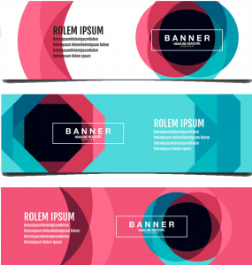
Think of your banner ad like a mini poster. You’ve got very little space, so every inch must count. There are three main elements you should arrange carefully:
#1. The Logo
Your logo is like your face — it helps people recognize who you are. When you design banner ads that get clicks, make sure your logo is easy to see right away. It doesn’t have to be huge, but it should be clear and placed where it’s instantly noticeable (like at the top or a corner). This builds trust. People who already know your brand will recognize it immediately, and new visitors will start remembering it.
#2. The Value Proposition
This is the heart of your ad — your main message or offer. It tells people what they’ll get and why it matters. Maybe it’s “50% Off Today Only” or “Grow Your Business Faster.” Whatever it is, it should be big, bold, and easy to read. Use simple words and strong colors to make it stand out. If your ad were a sentence, this is the part you’d say the loudest!
Remember, people scroll quickly and won’t stop to figure things out. The faster they understand your offer, the more likely they are to click.
#3. The Call-to-Action (CTA)
This is where the magic happens — it’s your “Click Here,” “Shop Now,” or “Learn More” button. After seeing your offer, people need a clear next step. Make your CTA pop with a bright color or bold button so it’s impossible to miss. It should look clickable and feel inviting.
When you put all three together — the logo for recognition, the value proposition for interest, and the CTA for action — your banner becomes easy to read, visually balanced, and naturally persuasive.
So, remember this: the secret to hierarchy isn’t about cramming everything into your ad — it’s about guiding your viewer’s eyes exactly where you want them to go. Do that right, and you’ll design banner ads that get clicks almost effortlessly.
#4. Framing Draws Attention
When you design banner ads that get clicks, one thing you can’t forget is how to make them stand out. Think about it — your banner isn’t floating alone on a blank screen. It’s surrounded by tons of other stuff: text, images, videos, and maybe even more ads. That means if your banner doesn’t grab attention right away, it’ll just disappear into the background like wallpaper.
That’s where framing comes in. Framing is like putting a nice border or outline around your ad to make it pop. It’s a simple trick, but it makes a huge difference. The goal is to guide people’s eyes straight to your message — kind of like how a picture frame draws your attention to the photo inside.
Here’s how to make framing work for you:
#1. Use Contrast to Stand Out
If the website background is white, don’t make your ad white too — it’ll blend right in. Instead, use a bold color or dark outline that sets your ad apart. When you design banner ads that get clicks, contrast is your best friend. The more your ad stands out from the rest of the page, the more likely people are to notice it.
#2. Keep the Frame Clean and Balanced
A good frame shouldn’t overpower the ad — it should highlight it. Think of it as adding polish, not noise. You can use borders, shadows, or even color gradients to make your banner feel complete and professional.
#3. Lead the Eyes Toward the Product
Your frame shouldn’t just sit there — it should help direct attention where it matters most: your product, your offer, and your call-to-action (CTA). Use shapes, lines, or even subtle patterns that naturally pull the viewer’s focus toward the center of your ad.
Framing is one of those small design details that quietly does a lot of work behind the scenes. It helps your banner stand out, get noticed, and most importantly, get clicks.
So the next time you’re trying to design banner ads that get clicks, don’t ignore the frame — it’s the invisible guide that leads the viewer’s eyes straight to your message.
#5. Animate Your Ad
When you design banner ads that get clicks, one of the smartest ways to grab attention is by adding a bit of animation. Imagine scrolling through a page filled with still pictures — then suddenly, one moves! Naturally, your eyes go straight to it. That’s the power of animation — it brings your ad to life and instantly makes people notice it.
Animated ads work because they stand out. They break the monotony of static content and can even tell a tiny story in just a few seconds. For example, a product can slide into view, a headline can fade in, or a button can gently bounce to encourage clicks. These little motions make your banner feel alive and exciting — and that’s exactly how you design banner ads that get clicks.
But here’s the catch — less is more. You don’t want to overdo it with flashing lights or wild movements that make people dizzy. Instead, keep your animation smooth, short, and meaningful. Think of it like adding spice to food — just enough to make it tasty, not overwhelming.
Here are a few easy tips for animating your banner ad:
#1. Keep It Short and Sweet
Stick to 15 seconds or less. Any longer, and people might scroll away before your message lands.
#2. Make the Motion Count
Every movement should have a purpose — whether it’s highlighting your product, revealing your offer, or leading people to your call-to-action (CTA).
#3. Avoid Being Too Flashy
Big, blinking animations can look cheap or annoying. Stick to subtle transitions like fades, slides, or gentle pops.
#4. End with a Clear Message
Your animation should end with a solid, still frame showing your product and CTA. That way, even if someone catches your ad midway, they still see what you’re promoting.
Animation adds life, personality, and movement — all of which can make your ad impossible to ignore. So, when you design banner ads that get clicks, don’t be afraid to add a little motion magic. Just remember: smooth, short, and smart wins every time.
#6. Colors Speak Louder Than Words
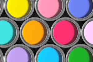
When you design banner ads that get clicks, color isn’t just decoration — it’s a secret weapon. Colors have the power to make people feel something instantly, even before they read a single word. That’s because our brains connect colors with emotions without us even realizing it. So, the colors you choose can make or break how your ad performs.
Think about it — ever noticed how fast-food brands love using red and yellow? That’s not random. Red triggers excitement and hunger, while yellow makes people feel happy and energetic. Together, they grab attention and make you want to take action. That’s the same effect you want when you design your banner ads — colors that make people stop scrolling and click.
Here’s a quick breakdown of how each color can work its magic when you’re trying to design banner ads that get clicks:
#1. Red — Energy and Urgency
Red grabs attention faster than any other color. It makes people feel a sense of excitement and pushes them to act quickly. It’s perfect for sales, discounts, or limited-time offers.
#2. Blue — Trust and Calm
Blue feels safe, professional, and clear. It builds confidence and reliability, which is why banks, tech brands, and social platforms love it. Use it when you want your audience to feel secure and comfortable clicking.
#3. Yellow — Happiness and Warmth
Yellow shines with energy and optimism. It’s the color of sunshine and joy, and it can make your ad look bright and friendly. But don’t go overboard — too much yellow can be overwhelming.
#4. Orange — Fun and Playfulness
Orange brings excitement without the urgency of red. It’s great for ads that promote creativity, entertainment, or lifestyle products. It gives off a cheerful, friendly vibe.
#5. Green — Growth and Positivity
Green feels fresh and natural. It’s great for health products, eco-friendly campaigns, or anything connected to money and success. It’s also easy on the eyes, which makes it comfortable to look at.
#6. Purple — Luxury and Imagination
Purple gives off a sense of mystery and sophistication. It’s often used by premium brands that want to look elegant or creative.
#7. Pink — Softness and Femininity
Pink is gentle, warm, and emotional. It’s ideal for ads aimed at women or products that emphasize care, beauty, and affection.
#8. White — Simplicity and Clarity
White keeps things clean and uncluttered. It gives your design room to breathe and makes your message pop. You can use it as background space to highlight your main offer.
#9. Black — Power and Prestige
Black is sleek, bold, and classy. It’s a favorite for luxury brands because it screams confidence and sophistication. It’s also great for making bright colors stand out even more.
When you design banner ads that get clicks, think of colors as your ad’s voice. They whisper emotions into people’s minds before words ever do. Choose colors that match your brand’s mood, use contrast to make important parts stand out, and don’t be afraid to experiment until your ad feels just right.
Because sometimes, the difference between a banner people scroll past and one they click comes down to one simple thing — the color that speaks to them.
#7. Keep Your Brand Vibe Consistent
When you design banner ads that get clicks, remember — the ad isn’t just a random box floating on the internet. It’s a small but powerful piece of your brand. People don’t just click on ads for fun; they click because something about it feels familiar, trustworthy, or exciting. That’s why keeping your brand consistency from the ad to the landing page is super important.
Think of it this way: when someone clicks your banner, they’re stepping from one room (your ad) into another (your website). Both rooms should feel like part of the same house. If your banner feels like a party but your website feels like a boardroom, people will get confused — and they’ll leave before you can even say “conversion.”
So, when you design banner ads that get clicks, make sure everything lines up with your brand style. That means:
#1. Match the Look and Feel
If your brand is sleek, calm, and professional, your ads should reflect that same energy — clean fonts, elegant colors, and simple layouts. On the other hand, if your brand is bold, fun, and youthful, your banners can have brighter colors, playful text, and lively images. Just make sure the ad and the landing page feel like they belong together.
#2. Keep the Same Tone
Your brand voice should sound the same everywhere. If your ad uses witty, friendly language, your website copy should sound just as approachable. Don’t switch from “Hey there, let’s get started!” in your ad to “Welcome to our esteemed establishment” on your landing page. That inconsistency breaks the trust you built in the first place.
#3. Use Consistent Logos and Elements
Your logo, fonts, and colors are part of your brand identity. Always use them consistently. This helps people instantly recognize your brand no matter where they see it — on an ad, a website, or social media post.
#4. Ensure a Smooth Transition
When someone clicks your ad, the page they land on should clearly connect to what the ad promised. If your banner says, “Get 20% Off All Sneakers,” don’t send them to your homepage — take them directly to the sneakers section. That’s how you keep the trust and momentum going.
Consistency builds credibility. It tells your audience, “You can trust us — we’re solid and professional.” And trust, more than anything else, is what makes people click, stay, and buy.
So, don’t just design ads that look good — design banner ads that get clicks because they feel good, too. When your ads and your website speak the same visual and emotional language, you don’t just attract attention — you create a lasting impression that keeps people coming back.
Conclusion
Banner ads are still one of the best ways to grab attention online — if you do them right. But here’s the truth: making people actually click your banner isn’t luck, it’s a skill. To design banner ads that get clicks, you need more than just pretty colors or catchy text. You need to understand what catches the human eye, what makes people curious, and what earns their trust in just a split second.
The good news? You’ve already got the roadmap. Every tip we’ve shared — from keeping your design simple and showing off your product to mastering color psychology and keeping your brand consistent — helps you design banner ads that get clicks and conversions, not just glances.
Here’s what to remember when creating your next ad:
Think like your audience. What would make you stop scrolling and click?
Keep your message clear and your design clean. People don’t have time to guess what you’re offering.
Use strong visuals and action-driven CTAs. Tell viewers exactly what to do — “Shop Now,” “Learn More,” or “Get Yours Today.”
Stay true to your brand. When your ad and landing page look and sound connected, people trust you more.
Test, tweak, repeat. Great ads are made through testing what works and improving what doesn’t.
At the end of the day, banner ads aren’t just digital decorations — they’re powerful tools that can pull in traffic, boost sales, and grow your brand. So take your time, follow these tips, and start crafting designs that don’t just sit there — but spark curiosity, drive clicks, and deliver real results.
Because when you design banner ads that get clicks, you’re not just running ads — you’re building attention, trust, and profit, one click at a time.