It is impossible to exaggerate the significance of landing page layout. It serves as the visitor’s initial impression of your business, a guide through your offerings, and an inspiration to take action. A well-designed layout creates an immersive experience that captivates, persuades, and converts visitors in addition to showcasing your goods and/or services.
The layout of a landing page may make or break a marketing effort in the digital era, when consumers have short attention spans and intense competition. Landing pages operate as a brand’s online storefront, the initial point of contact where users choose whether to interact with the content further or leave.
Implementing best practices in landing page layout that maximize user experience and boost conversions is crucial if you want to take advantage of this key period.
We will travel through the nuances of recommended practices for landing page layout in this article. We will reveal the techniques that turn common landing pages into conversion engines, from streamlining design aspects to utilizing social proof and optimizing for mobile phones.
Come along as we reveal the techniques for creating captivating landing page layouts that enthrall visitors and provide noticeable outcomes.
Table of Contents
ToggleWhat are the Significances of Landing Page Layout?
It is of great value to understand the significance of layout optimization before going into its details. A well-designed layout should lead visitors through a smooth journey that ends in action, not just look good. This is why the layout of a landing page matters:
#1. First Impressions: Just like in real life, first impressions matter online. A well-organized and visually appealing layout can capture visitors’ attention and encourage them to explore further.
#2. User Engagement: A cluttered or confusing layout can frustrate users and drive them away. Conversely, a clean and intuitive layout can keep them engaged and focused on your message.
#3. Conversion Optimization: Ultimately, the goal of a landing page is to convert visitors into customers or leads. An optimized layout directs users’ attention to key elements such as call-to-action (CTA) buttons and forms, increasing the likelihood of conversion.
The 8 Effective Landing Page Layout Best Practices
Now that the significance of landing page layout has been established, let us examine some landing page layout best practices to maximize its effectiveness:
#1. Keep it Simple and Clean
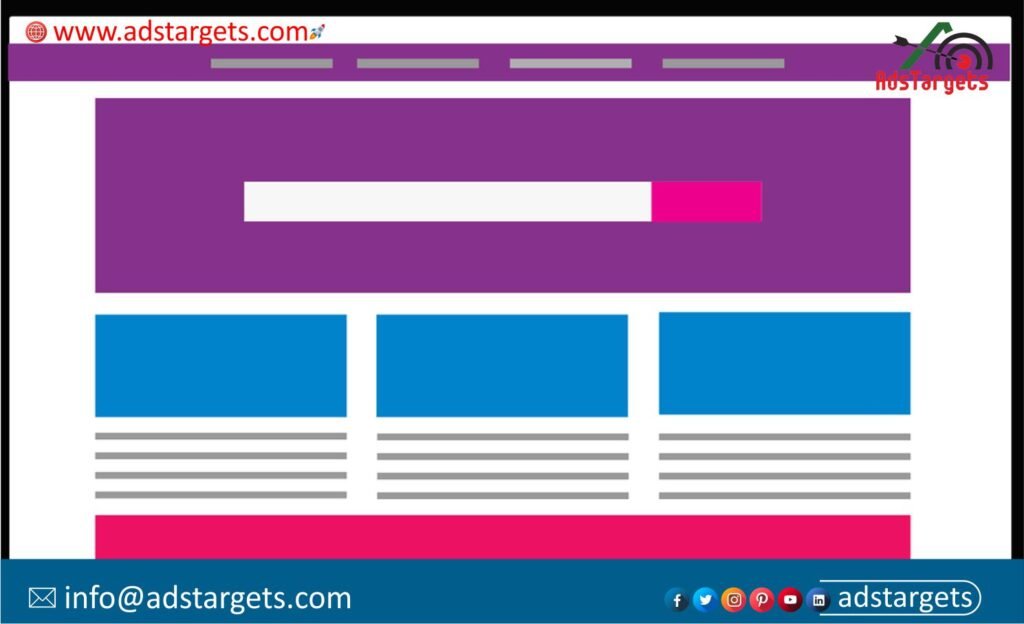
One design approach that works exceptionally well for landing page design is a minimalist design. This style emphasizes simplicity, using clean lines, ample white space, and minimal distractions. Minimalist designs help keep the focus on the content and the CTA, making it easier for visitors to understand your message and take action.
Minimalism: Keep things simple by concentrating on what matters most. In order to lessen distractions, keep the design simple and uncomplicated.
Whitespace: To provide breathing area between items, use whitespace liberally. This improves reading and creates a cozier feeling on the page.
Consistent Design: Ensure that the page’s graphics, typefaces, and colors are all consistent. Maintaining consistency strengthens brand identity and fosters familiarity.
#2. Prioritize Above-the-Fold Content
Above-the-Fold: Place the most important elements, such as the headline, value proposition, and primary CTA, within the viewport without requiring scrolling. This ensures that visitors see the most crucial information immediately.
Engaging Headline: Craft a compelling headline that grabs attention and communicates the value proposition succinctly. Use persuasive language that resonates with your target audience.
Visual Appeal: Incorporate captivating imagery or videos above the fold to visually communicate your message and evoke emotion.
#3. Create a Clear Visual Hierarchy
Typography: Use font size, weight, and style to create a clear hierarchy of information. Headings and subheadings should be larger and bolder than body text to draw attention.
Color Contrast: Use color strategically to highlight important elements such as CTAs. Contrast between foreground and background colors can make key elements stand out.
Visual Cues: Use arrows, icons, or other visual cues to guide users’ attention toward important content or actions. Visual cues help users navigate the page more intuitively.
#4. Optimize for Mobile Responsiveness
Responsive Design: With the increasing prevalence of mobile browsing, it’s crucial to ensure that your landing page is optimized for all devices. Adopt a responsive design approach to ensure seamless user experience across various screen sizes and orientations.
Mobile-First Approach: Design the mobile version of your landing page first, considering the constraints of smaller screens. Then, scale up to larger screens, ensuring that the layout remains intuitive and functional.
Touch-Friendly Elements: Make sure buttons and interactive elements are large enough and have enough spacing to be easily tapped on touchscreen devices.
#5. Use Compelling Visuals
Picture yourself gazing upon a breathtaking scenery, the vibrant colors and stunning vistas filling you with awe and wonder. That is the power of captivating visuals on a landing page. From striking images to mesmerizing videos, visuals have the ability to evoke emotion and create a sense of intrigue that draws visitors in.
High-Quality Images: Use high-resolution images that are relevant to your product or service. Avoid generic stock photos in favor of authentic imagery that resonates with your audience.
Video Content: Incorporate videos to showcase product demonstrations, customer testimonials, or brand stories. Videos can be highly engaging and effective in communicating complex messages.
Visual Consistency: Ensure visual consistency across the page, including imagery, colors, and typography. Consistent visuals create a cohesive user experience and reinforce brand identity.
#6. Include Social Proof and Trust Signals
Imagine meeting a stranger for the first time—uncertain, wary, and hesitant to let your guard down. Now imagine reuniting with an old friend—warm, familiar, and trustworthy. That is the power of trust and credibility on a landing page.
By incorporating elements such as customer testimonials, industry awards, and trust badges, a layout that inspires confidence and reassures visitors that they are in good hands.
Testimonials and Reviews: Feature testimonials or reviews from satisfied customers to build credibility and trust. Real-life experiences from other customers can alleviate doubts and encourage conversions.
Trust Badges: Display trust badges such as security seals, certifications, or affiliations to reassure visitors about the safety and reliability of your website. Trust badges can help alleviate concerns about privacy and security.
Statistics and Data: Incorporate relevant statistics or data points that highlight the value or efficacy of your product or service. Quantifiable evidence can persuade skeptical visitors and justify their decision to take action.
#7. Optimize Load Times
Image Optimization: Optimize images to reduce file size without sacrificing quality. Compress images using tools like JPEG Optimizer or TinyPNG to improve page load times.
Minimize HTTP Requests: Reduce the number of HTTP requests by combining CSS and JavaScript files, using CSS sprites, and minimizing the use of third-party scripts.
Browser Caching: Leverage browser caching to store static assets locally, reducing the need for repeated downloads and speeding up page load times for returning visitors.
#8. A/B Testing and Iteration
The most successful marketers are also crazy scientists; they test out various designs, messages, and content frequently to see what works best with the audience they are targeting.
Once your landing page has been published, think about the most important things you hope to discover from a split test and the approach you’ll take to test it.
Continuous Testing: Conduct A/B tests to compare different variations of your landing page layout and content. Test elements such as headlines, CTAs, imagery, and form fields to identify what resonates best with your audience.
Data-Driven Decisions: Use data from A/B tests to make informed decisions about layout optimization. Analyze metrics such as conversion rates, bounce rates, and time on page to understand the impact of layout changes on user behavior.
Iterative Improvement: Iterate on your landing page based on insights gathered from A/B testing. Continuously refine your layout and content to improve conversion rates and user experience over time.
Conclusion
Crafting an effective landing page layout requires a strategic approach that balances aesthetics with functionality. By following the landing page layout best practices outlined in this article, you can create landing pages that captivate visitors, communicate your message effectively, and drive desired actions.
Remember that landing page optimization is an ongoing process, and it’s essential to monitor performance metrics and iterate based on data-driven insights. With a well-executed layout and continuous optimization efforts, you can maximize the impact of your landing pages and achieve your marketing goals.
Through the implementation of landing page layout best practices, such as maintaining a simple and clean design, giving precedence to information above the fold, and optimizing for mobile responsiveness, companies may produce landing pages that effectively captivate viewers and stimulate conversions.
Moreover, the use of captivating images, social evidence, and trust signals enhances the page’s legitimacy and persuasiveness, and optimizing load times guarantees a smooth user experience. Businesses can optimize landing page design to enhance conversion rates and accomplish their marketing goals by iteratively improving them and doing ongoing A/B testing.
Through adherence to these landing page layout best practices and ongoing approach optimization, businesses can fully realize the potential of their landing pages and achieve unprecedented success with their digital marketing endeavors. Businesses may establish deep connections with their audience and promote long-term growth in the cutthroat online market with a landing page layout done correctly.


