Who doesn’t want to double their landing page conversions? More conversions simply translate to more revenue, and every marketer wants that kind of win. But when it comes to real implementation, landing page optimization isn’t always as straightforward as it looks.
Most people run a few quick tests, tweak one or two elements, and then pack up for the day. And what happens next? If they’re lucky, the conversion rate crawls up by a tiny margin… maybe. The truth is, meaningful results don’t come from surface-level changes or swapping button colors.
No.
If we truly want to see dramatic improvements, our approach to landing page optimization has to go deeper and get more intentional. And that’s where the real magic begins.
Here are four powerful techniques that, when used together, can significantly boost your conversions and quite possibly help you achieve that goal of doubling your results. Let’s dive in.
Table of Contents
ToggleFour Powerful Techniques To Significantly Boost Your Conversions

#1. USE A POPUP
Whether you adore them or absolutely can’t stand them, popups are one of those tools that simply work. You’ll rarely hear a user say, “Wow, I just love popups!” — and honestly, I wouldn’t expect to. But talk to any seasoned marketer or conversion expert, and they’ll tell you that popups are one of the most reliable boosters in landing page optimization.
Why? Because they grab attention, interrupt passiveness, and prompt action. And when you’re focused on landing page optimization, that moment of interruption can be the difference between a visitor who leaves quietly and one who actually converts.
Sure, popups can be annoying. Yes, some users will roll their eyes or bounce. But the data is consistent: when done right, they increase conversions — often significantly.
To make your popups work smarter, not harder, here’s how to maximize their effectiveness:
#1. Use popups for email subscriptions.
Email lists remain one of the strongest assets you can build, and popups are incredible at capturing sign-ups.
#2. A/B test different popup versions.
Test headlines, visuals, timing, and offers. Small adjustments can reveal what truly resonates with your audience.
#3. Trigger the popup at the right time — ideally around 60 seconds.
This gives users a chance to explore your page before being interrupted, which makes the offer feel more relevant and less intrusive.
#4. Craft an explosive, compelling headline.
Your headline should instantly tell users what’s in it for them — and why they should care now.
#5. Highlight the benefits clearly.
Don’t make visitors guess. Spell out why subscribing or taking your offer is worth their time.
#6. Keep the form short and sweet.
Ask for only what you really need — no more than three fields. The shorter the form, the higher the conversions.
Popups may not win popularity contests, but when used strategically, they can become one of your most powerful assets for improving engagement, capturing leads, and pushing your conversions to new heights.
#2. MAKE EVERYTHING BIGGER
One of the simplest — yet most underrated — tricks in landing page optimization is this: make things bigger. Bigger elements command attention, reduce friction, and guide your visitors exactly where you want them to go. When people land on your page, they’re scanning, not studying. Larger elements help them instantly understand your message without having to think too hard.
If you want your landing page to convert like a machine, here are the three elements you should absolutely enlarge:
#1. Headline
Your headline is the main event. More users will read your headline than any other piece of content on your page. If there’s anything that deserves to shout loudly and proudly, it’s this.
Make it bold.
Make it huge.
Make it crystal clear.
A strong, oversized headline sets the tone and tells visitors whether they should stay or bounce. When it comes to landing page optimization, a big headline creates instant clarity — and clarity fuels conversions.
#2. Images
Hero images are basically the runway models of modern web design — front and center, impossible to ignore, and doing all the heavy lifting visually.
Full-width hero images don’t just look beautiful; they create an emotional connection. They immerse users into the experience and subtly nudge them toward taking action.
The best hero images:
Stretch across the entire screen
Are sharp and high-quality
Communicate a mood or message
Are fully responsive on all devices
In landing page optimization, visuals aren’t decoration — they’re persuasion tools. And bigger imagery delivers bigger impact.
#3. CTAs (Call-to-Action Buttons)
Your CTA is the money-maker. It’s the final invitation where a visitor becomes a lead, customer, or subscriber. If there’s any element you should unapologetically enlarge, it’s your CTA.
By making it bigger, you:
Increase visibility
Reduce hesitation
Make the next step obvious
Encourage more clicks
A tiny CTA buried somewhere on the page is the digital equivalent of whispering your offer. A large, bold, beautifully placed CTA? That’s you confidently saying, “Here’s what to do next.”
In the world of landing page optimization, there’s a reason the rule “bigger is better” keeps showing up — because it works. When you scale up your most important elements, you reduce cognitive load, amplify your message, and guide visitors straight toward conversion.
Bigger is not just a design choice — it’s a conversion strategy.
#3. ADD MORE CTAS
If there’s one thing many marketers underestimate, it’s the power of adding more CTAs. Think of CTAs as the doorways to conversion — the more doors you offer, the more chances a visitor has to walk through one.
A lot of traditional landing page optimization advice says, “Just put your CTA above the fold.” Sure, that’s important. But what happens when your visitor actually wants to read more first? Maybe they’re scrolling through your benefits, checking out your pricing breakdown, or watching a product video. If there’s no CTA waiting for them when they’re ready to take action… you lose that moment. And in landing page optimization, losing a moment often means losing a conversion.
Here’s the truth:
A user can decide to convert at any point — so you should have a CTA ready at every point.
Here’s how to do it right:
#1. Place a CTA above the fold. This catches the fast decision-makers — the ones who know what they want immediately.
#2. Add a CTA after your video. Videos are powerful persuasion tools. Once someone finishes watching, their motivation is at its peak. Give them a button to click.
#3. Drop a CTA right after your benefits section. If you’ve just convinced someone that your offer solves their problem, don’t make them scroll around hunting for the next step.
#4. Include a CTA below your testimonials. Social proof warms people up beautifully. Reward that warm feeling with a clear call to action.
#5. Sprinkle CTAs through long-form content. The deeper someone reads, the more invested they become. Make it easy for them to convert without scrolling back up or giving up.
The goal isn’t to spam your page with buttons — it’s to strategically place CTAs where a user is most likely to say “yes.”
When done correctly, adding more CTAs gives your visitors multiple natural exit points toward conversion, and that alone can dramatically increase your results. In the world of landing page optimization, the rule is simple: if a moment of interest exists, a CTA should exist right beside it.
#4. LONG-FORM VS. SHORT-FORM LANDING PAGES: WHICH CONVERTS BETTER?
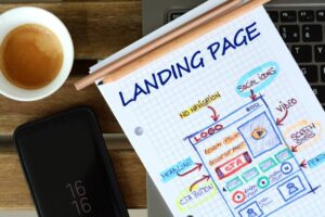
If you’ve ever wondered whether a long-form landing page or a short one performs better, here’s the truth: long-form is winning more often than not — and for good reason.
When you build a long landing page packed with images, features, benefits, videos, testimonials, and other engaging content, your page becomes more than just a stopover. It becomes a place where visitors spend time, engage with your brand, and develop trust in your product or service. Simply relying on a headline and a few bullet points rarely convinces someone to take action — especially for higher-value offers or more considered purchases.
A well-crafted long-form landing page allows you to:
#1. Answer questions: Anticipate what your visitors might be wondering and provide clear, concise answers.
#2. Address objections: Solve potential concerns before they become a reason to bounce.
#3. Build trust: Use testimonials, case studies, or certifications to reassure visitors they’re making the right decision.
#4Create emotional persuasion: Connect with users by showing how your product or service improves their life, solves a problem, or fulfills a need.
#5. Display data and social proof: Stats, charts, and metrics can validate your claims and enhance credibility.
#6. Showcase visuals: High-quality images and explainer videos allow users to experience the product even before purchase.
#7. Feature the product: Detailed walkthroughs, demos, and step-by-step explanations help visitors understand your offer fully.
Some of the most dramatic improvements I’ve seen in landing page optimization happened when pages expanded six times their original length. And I’m not talking marginal gains — I’m talking exponential jumps in conversions.
But here’s the caveat: longer doesn’t automatically mean better. Your content must be organized, engaging, and persuasive. Every section should guide visitors toward a single conversion goal. Overwhelming your users with irrelevant info or clutter can backfire.
Pro tip: Always split-test your landing page variations. Test not only the length but also the placement of CTAs, visuals, headlines, and videos. Conversion rate improvements will show up, but make sure you track them in raw numbers, not just percentages.
In the end, landing page optimization is all about giving your visitors everything they need to make a confident decision — and sometimes that requires a little more content, not less. Longer, well-structured pages that answer questions, build trust, and highlight benefits consistently outperform short, minimalist designs.
Conclusion
Doubling or even significantly improving your conversion rates isn’t about tweaking one element and hoping for the best. Landing page optimization is a holistic process it’s about combining the right strategies, testing them continuously, and understanding your audience’s behavior.
From using popups effectively, making your key elements bigger, adding multiple CTAs, to experimenting with long-form content, every adjustment plays a role in guiding visitors toward taking action. The most successful landing pages answer questions, build trust, and provide irresistible reasons to convert.
Remember, there’s no one-size-fits-all solution. Split testing is your best friend, and consistent iteration ensures you’re always improving. By strategically applying these landing page optimization techniques, you give your visitors the best possible experience while maximizing conversions and, ultimately, revenue.
The takeaway from this is: optimize smartly, test relentlessly, and never stop refining — that’s how you turn visitors into loyal customers.

