Welcome to the digital era, where how you show up online can either make or break your business’s success. In this modern landscape, your landing page acts as your first impression, like a virtual handshake with potential customers. However, not all handshakes leave a lasting impact.
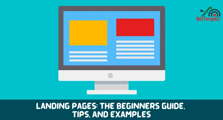
Landing pages serve as the first impression of your website to potential customers. Their design and content play a crucial role in driving conversions.
Landing pages are designed with a specific goal in mind – to convert visitors into leads or customers. Whether it’s encouraging users to make a purchase, sign up for a newsletter, or download a resource, every element on the landing page should work harmoniously to achieve this objective.
In this article, we explore the important factors that turn your landing page from a basic web page into a powerful tool for getting people to take action.
We’ll discuss how things like color and design can affect people’s feelings, as well as the persuasive power of writing great content. We’ll reveal the secrets to making landing pages that not only draw in visitors but also convince them to become repeat customers.
Whether you’re starting a new business, working in digital marketing, or just want to improve your online presence, get ready to learn about the clever tricks and techniques for making your landing pages more effective. Let’s change those clicks into actual sales!
LANDING PAGE ELEMENTS THAT DRIVE CONVERSIONS
#1. Headlines
Crafting a catchy headline is like putting a big sign outside your shop to grab people’s attention. When someone lands on your page, the headline is the first thing they see, so it’s super important to get it right.
A good headline should be short and snappy, telling people what your page is all about in just a few words. It needs to make them want to keep reading, so it’s got to be interesting and exciting.
One way to do this is by using descriptive language that tells people what they’ll get out of using your product or service. For example, if you’re selling a super comfy mattress, your headline might say something like “Sleep Like Never Before with Our Luxurious Mattress!”
By using words that paint a picture of the benefits, you’re giving people a reason to stay and find out more. It’s like giving them a taste of what’s to come and making them curious to learn more. So, make sure your headline is clear, and catchy, and tells people why they should stick around.
#2.Unique Selling Propositions (USPs)
When you’re trying to sell something online, it’s really important to show people why your thing is special. That’s where your unique selling propositions (USPs) come in.
Your USPs are the things that make your product or service different from everything else out there. Maybe it’s the fact that your thing is cheaper, better quality, or more convenient to use. Whatever it is, you need to tell people about it loud and clear.
By highlighting your USPs, you’re showing people why they should choose you over anyone else. It’s like saying, “Hey, look at this cool thing we’ve got that no one else does!”
So, when you’re writing about your product or service on your landing page, make sure you talk about what makes it special.
Tell people why it’s better than the rest and why they should pick you. Whether it’s the price, the quality, or something else entirely, make sure your USPs shine through and convince people to take action.
#3. Clear Call-to-Action (CTA) Buttons
The call-to-action (CTA) button is like the big, shiny button that tells people what to do next when they visit your website. It’s super important because it’s what gets people to take action, like buying something, signing up, or getting more information.
You need to make sure your CTA button stands out and grabs people’s attention. It should be easy to find on the page, and it should look nice too.
A good CTA button uses words that make people want to click it right away. For example, instead of saying “Submit,” you might say “Get Started Now!” to make it more exciting.
It’s also a good idea to create a sense of urgency with your CTA button. This means making people feel like they need to act quickly before they miss out on something great. You could use words like “Limited Time Offer” or “Don’t Miss Out!” to encourage people to click right away.
So, when you’re designing your landing page, make sure your CTA button is clear, eye-catching, and makes people feel like they need to act fast.
#4. A/B Testing Variations
A/B testing is like doing a science experiment with your landing page. It lets you try out different things to see what works best for the people who visit your website.
You can test lots of different stuff, like the words you use in your headline, the colors of your buttons, or even where you put things on the page. Then, you see which version gets more people to do what you want them to do, like buying something or signing up.
By testing different variations, you can figure out what your audience likes the most. Maybe they prefer a headline that’s funny instead of serious or a button that’s blue instead of red. Whatever it is, you can use the results to make your landing page even better.
It’s important to keep testing regularly and using the results to make changes. This way, you’re always improving and making sure your landing page is as good as it can be for the people who visit it.
#5. Images and Visuals
Images and visuals are like the pictures in a storybook – they help tell the story of your landing page. They’re really important because they catch people’s eye and show them what your page is all about.
When choosing images, it’s best to pick ones that are clear and look nice. They should also match what your page is about, so people know what to expect. For example, if you’re selling clothes, you’ll want pictures of people wearing them, not pictures of food!
It’s also important to make sure your images load quickly. Nobody likes waiting around for a page to load, so you want to make sure yours is super fast. This means using images that aren’t too big and making sure your website is set up to load everything quickly.
By choosing the right images and making sure they load fast, you’re making it easier for people to understand what your page is about and encouraging them to stick around. It’s like putting up a nice picture in your shop window – it makes people want to come inside and see more!
#6. Social Proof
Think of social proof like getting a thumbs-up from your friends before trying something new. It’s all about showing people that other folks like what you’re offering, which makes them more likely to trust you.
You can do this by sharing stories from happy customers kind of like sharing a good review. When people see that others have had a great experience with your product or service, it helps them feel confident that they’ll have a good experience too.
You can also share case studies, which are like success stories that show how your product or service helped someone solve a problem. This helps people see real-life examples of how your thing can make a difference.
By showing social proof on your landing page, you’re letting people know that they’re not the first ones to try your thing – lots of other people have tried it and loved it too.
This builds trust and makes people more likely to give it a go themselves. It’s like having your friends recommend a restaurant – you know it’s going to be good!
#7. Mobile Responsiveness
Nowadays, most people use their phones to go online, so it’s really important to make sure your landing page looks good on mobiles too.
Mobile responsiveness means making sure your page works well on small screens, like those on phones and tablets. You want it to look just as good and be just as easy to use as it is on a big computer screen.
To do this, you need to design your page so that it adjusts automatically to fit different screen sizes. This way, whether someone’s looking at it on a tiny phone or a big tablet, everything still looks neat.
It’s also a good idea to test your page on different devices to make sure everything works properly. Sometimes things might look a bit wonky on one type of phone but fine on another, so it’s worth checking.
By making sure your landing page is mobile-responsive, you’re making it easier for people to use, no matter what device they’re using. It’s like making sure your shop door is wide enough for everyone to get through – you want to welcome in as many people as possible!
#8. Conversion Metrics
Monitoring conversion metrics is like keeping an eye on how well your landing page is doing its job. It’s important to know if people are doing what you want them to do when they visit your page.
There are a few key things you can track to see how well your landing page is working. One is the conversion rate, which is how many people take the action you want them to take, like buying something or signing up.
Another important thing to look at is the bounce rate, which is how many people leave your page without doing anything. You also want to see how long people are staying on your page, which is called the average session duration.
To track all this stuff, you can use tools like Google Analytics. This lets you see what people are doing on your site and where they’re coming from. You can use this information to figure out what’s working well and what needs improving.
By keeping an eye on your conversion metrics and making changes based on what you find, you can make sure your landing page is as effective as possible. It’s like adjusting the sails on a boat to catch the best wind – you want to keep moving forward!
#9. Form Fields
When you’re asking people to fill in a form on your landing page, you want to make it as easy as possible for them. Imagine filling in a form like filling in a shopping list – you want to get what you need quickly and without any hassle.
To do this, it’s best to keep your form short and sweet. Only ask for the stuff you need, like someone’s name and email address. You don’t want to overwhelm people with lots of questions because they might get bored or frustrated and give up.
By keeping your form fields to a minimum, you’re making it easier for people to finish filling it in. It’s like only putting the essentials on your shopping list – you don’t want to clutter it up with unnecessary stuff.
So, when you’re designing your form, think about what information you need and what can wait. By keeping things simple, you’re making it more likely that people will complete the form and take the action you want them to take.
#10. Scannable Content
When people visit your landing page, they might not read everything you’ve written word for word. Instead, they might just skim through it quickly to get the main idea. That’s why it’s important to make your content easy to scan.
Think of your content like a recipe book – you want people to be able to find what they’re looking for without having to read every single page. To do this, break up your content into smaller chunks using things like headings and bullet points. This makes it easier for people to find the information they need.
You also want to highlight the most important bits, like the benefits of your product or service. Just like how a recipe might highlight the key ingredients, you want to draw attention to the things that will grab people’s interest.
By making your content scannable, you’re making it more likely that people will stick around and find out more about what you’re offering. It’s like making sure your recipe book is easy to use – you want people to enjoy the dishes inside!
#11. Urgency and Scarcity
Imagine you’re at a shop, and you see a sign that says “Sale ends today!” You might feel like you need to buy something quickly before you miss out. That’s because the shop is using urgency and scarcity to make you want to buy things.
On your landing page, you can do the same thing to encourage people to take action. You might use words like “Hurry!” or “Limited time offer!” to make people feel like they need to act fast. You can also use countdown timers to show people how much time they have left to take advantage of an offer.
By creating a sense of urgency and scarcity, you’re making people feel like they need to act quickly before they miss out on something good. It’s like telling someone there’s only one slice of cake left – they’re more likely to grab it before someone else does!
So, when you’re designing your landing page, think about how you can use urgency and scarcity to motivate people to take action. By tapping into the fear of missing out, you can encourage people to convert before the opportunity disappears.
#12. User Navigation
Imagine your landing page is like a map, and your visitors are trying to find their way to the treasure – the thing you want them to do, like buy something or sign up. It’s important to make sure they can find it without getting lost along the way.
To do this, you need to look at how people move around your page. Are there any places where they seem to get stuck or confused? Maybe there are too many buttons or links, and they don’t know which one to click.
You want to make sure the navigation is really easy to follow, like following a trail of breadcrumbs through the woods. This means getting rid of anything that might distract people or lead them away from the treasure.
By analyzing user navigation, you can make sure your landing page is like a well-marked path that leads straight to the treasure. This makes it more likely that people will do what you want them to do and not get lost along the way.
#13.Persuasive Copy
Imagine your landing page is like a conversation between you and your visitors. You want to convince them to do something, like buy your product or sign up for your newsletter. That’s where copywriting comes in – it’s the words you use to persuade people to take action.
To write compelling copy, you need to understand what your visitors want and what problems they’re trying to solve. Maybe they’re looking for a way to save time, or they want to feel more confident about themselves. Whatever it is, you need to show them how your offer can help.
You want to use words that make people feel something – like excitement, relief, or hope. It’s like telling a story that grabs people’s attention and makes them want to keep reading.
By focusing on your audience’s needs and using language that resonates with them, you can create copy that speaks directly to their emotions and aspirations. This makes it more likely that they’ll take action and do what you want them to do.
#14. Trust Signals
Imagine you’re meeting someone new for the first time. You might feel a bit unsure about them – you don’t know if you can trust them yet. That’s how visitors might feel when they land on your page for the first time.
To help them feel more confident, you can use something called trust signals. These are like little signs that show people they can trust you. It might be things like security badges that say your website is safe, or certifications that show you’re good at what you do.
You want to make sure these trust signals are easy to see, like putting them on a big sign outside your shop. This way, people can see them straight away and feel more comfortable about sticking around.
By using trust signals, you’re showing people that you’re trustworthy and reliable. This makes them more likely to engage with your brand and take the action you want them to take. It’s like giving them a friendly handshake and saying, “Don’t worry – you’re in safe hands here!”
#15. Exit-Intent Popups
Imagine your website is like a busy street, and people are walking past all the time. But sometimes, just as someone is about to leave, you want to catch their attention and give them a reason to stay a bit longer.
That’s where exit-intent popups come in. They’re like a friendly tap on the shoulder as someone is about to walk away. These popups appear when someone moves their mouse to leave the page, and they offer something special to try and get them to stay.
You might offer a discount on their next purchase or give them a freebie like an e-book or a guide. It’s like giving someone a little treat to make them reconsider leaving.
You want to make sure your message is persuasive, like saying, “Wait! Don’t go yet – we’ve got something special for you!” This encourages people to stop and think before clicking away.
By using exit-intent popups, you’re giving yourself one last chance to convince people to stay or at least leave their contact information so you can keep in touch. It’s like a friendly reminder that there’s still more to see and do on your website.
#16. Traffic for Personalization
Segmenting your traffic based on demographics, behavior, or interests allows you to deliver personalized experiences tailored to the specific needs of different audience segments.
Create targeted landing pages for different customer personas, optimizing the content and offers to resonate with each group. By delivering relevant messaging, you can increase engagement and conversion rates.
#17. Benefits Over Features
When highlighting your product or service, focus on the benefits rather than just the features. Help visitors understand how your offer can address their needs and solve their problems, painting a vivid picture of the positive outcomes they can expect.
By showcasing the value proposition in clear and compelling terms, you can inspire action and drive conversions.
#18. Page Load Speed
Page load speed significantly impacts user experience and can affect conversion rates. Optimize your landing pages for fast load times by minimizing HTTP requests, compressing images, and leveraging browser caching.
Use tools like Google PageSpeed Insights to identify performance bottlenecks and implement optimizations to improve load speed.
CONCLUSION
In the world of digital marketing, landing pages are like the front door to your online shop. They’re the first thing people see when they visit your website, and they play a big role in whether someone decides to buy something or not.
To make sure your landing pages are doing their job well, you need to pay attention to every little detail. That means choosing the right words, picking the best images, and making sure everything works smoothly on mobiles and computers.
But it doesn’t stop there – you also need to keep an eye on how well your landing pages are doing. Are lots of people clicking on your buttons, or are they leaving without doing anything? By keeping track of this stuff, you can figure out what’s working well and what needs improving.
And don’t forget to keep experimenting and trying new things. Just because something works well now doesn’t mean it’ll work forever. By staying on top of the latest trends and making changes based on what you learn, you can make sure your landing pages are always as effective as possible.