I have been designing for 15 years, and in this guide, I will share case studies of poor user experience and the lessons learned.
I will reveal what I wish someone had told me about UX design when I was just starting. You don’t need an expensive course or a degree to master this.
Stick around, and you will draw inspiration from these poor user experience examples and learn valuable lessons to avoid similar pitfalls in your own UX journey.
My goal is to make this practical and straightforward so you can improve your design skills without breaking the bank.
We will explore real-life cases where user experience fell short, why it happened, and how it was fixed.
You will see how small changes can make a big difference in user satisfaction and website performance.
Whether you are a newbie or a seasoned designer, these insights will help you create more intuitive and user-friendly designs.
Get ready to learn from these mistakes and elevate your UX design skills. With the right approach and mindset, you can turn any poor user experience into a positive one. Let’s go in and make your designs better than ever.
Table of Contents
ToggleWHAT ARE COMMON EXAMPLES OF POOR USER EXPERIENCE?

#1: Examples of Poor User Experience: GetANewsletter’s linear product tour
GetANewsletter is a tool designed to help you send email newsletters to your subscribers. Like many SaaS companies, it starts its onboarding flow with a product tour.
The aim here is to showcase the core features of the product so that new users can quickly get acquainted and dive right in.
However, GetANewsletter’s product tour is a linear one, and this is where the problems begin.
The Problem with GetANewsletter’s Linear Product Tour
In their eagerness to display all their features, GetANewsletter prompts users to send a newsletter before they’ve even successfully added their email list. This approach is not only premature but also confusing for users. Here’s why:
#1. Lack of Logical Sequence: The product tour forces users to follow a specific order, which doesn’t necessarily align with the natural workflow. Sending a newsletter should logically come after setting up and uploading an email list.
#2. Overwhelming Information: By showing off all the features at once, new users can feel overwhelmed and unsure about what to prioritize. They might end up missing essential steps, leading to frustration.
#3. User Confusion: When users are asked to send a newsletter without having an email list ready, they can feel lost and unsure about how to proceed. This confusion can lead to a poor user experience and potentially drive users away from the product.
Suggestions to Fix the Issues
#1. Interactive and Modular Onboarding: Instead of a linear tour, GetANewsletter should consider an interactive and modular onboarding process. Allow users to explore different features at their own pace, focusing on the most critical tasks first.
#2. Contextual Guidance: Provide guidance and tips relevant to the current task. For example, when users are setting up their email list, offer tips on how to import contacts, manage lists, and segment audiences. Once the list is set up, guide them through creating and sending newsletters.
#3. Progressive Disclosure: Introduce features progressively. Start with the basics, such as setting up the email list, and gradually introduce more advanced features. This way, users won’t feel overwhelmed with information all at once.
#4. User Feedback and Testing: Regularly gather feedback from new users about the onboarding process. Conduct usability testing to identify pain points and areas of confusion. Use this data to continuously improve the user flow.
#5. Visual Cues and Checklists: Use visual cues, such as checkmarks and progress bars, to indicate completed steps and what’s next. A checklist can help users keep track of what they’ve done and what they need to do next.
#6. In-App Assistance: Provide in-app assistance, such as tooltips, help buttons, and live chat support. If a user gets stuck, they should have easy access to help without leaving the app.
GetANewsletter’s linear product tour exemplifies poor user experience due to its illogical sequence and overwhelming information dump. When you adopt a more user-friendly onboarding process—one that is interactive, contextually guided, progressively disclosed, and supported by visual cues and in-app assistance—GetANewsletter can significantly improve its user flow. This approach will not only enhance user satisfaction but also increase user retention and engagement. I hope you have picked a lesson from this case study of poor user experience.
#2. Examples of Poor User Experience: IPVanish Confuses Trendy With Timely
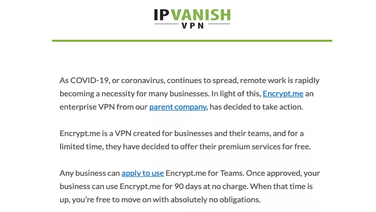
When all the chaos of the COVID-19 pandemic started, I received an email from IPVanish, a company that provides VPN services to consumers and businesses.
Their message, along with several others from different SaaS companies, all had the same underlying tone of forced empathy. Here are some more nauseating examples of the copywriting that flooded my inbox:
“We all need to pull together to get through this crisis.”
“Use our product to ensure your business still has customers in these challenging times.”
“We’re giving away 5% of our profits to local hospitals.”
These emails were clearly attempts to outdo each other in showing concern for my well-being during a stressful time.
While they might have occasionally won a sympathy vote, they were mostly empty virtue signaling disguised as an attempt to be trendy.
This scenario is a classic example of poor user experience. Companies were so focused on appearing concerned and trendy that they missed the mark on genuine connection and relevance. Instead of providing value, these emails felt insincere and opportunistic, creating a disconnect between the companies and their users.
Ways to Fix It
#1. Genuine Connection:
Instead of generic messages, personalize the communication. Understand the specific needs and concerns of your users and address those directly.
Example Response: “We know these times are challenging. If you need help with securing your online activities while working from home, our team is here to support you with extended trial periods and personalized assistance.”
#2. Value-Driven Content:
Provide actionable advice or resources that can genuinely help your users. Offer free guides, webinars, or special features relevant to the current situation.
Example Response: “To help you stay secure while working remotely, we’re offering a free guide on the best VPN practices and a webinar with our security experts. Let’s navigate this together.”
#3. Authenticity Over Trendiness:
Be honest and transparent about what your company can do to help without overplaying the emotional card.
Example Response: “We care about your online security. While we continue to ensure our services are reliable, we also want to offer extra support during these times. Contact us for customized solutions tailored to your needs.”
#4. Community Support:
If you are contributing to a cause, be specific and show the impact of your efforts.
Example Response: “We’re donating 5% of our profits to local hospitals. Here’s how your support is making a difference: [Link to detailed report or stories].”
Lesson to Learn
The key takeaway here is the importance of authenticity and value in user communication. During crises, users seek genuine support and practical solutions, not empty gestures. To improve user experience, always prioritize the real needs of your audience over trying to appear trendy. By doing so, you build trust and foster long-term loyalty.
Practical Applications
#1. Personalized Communication:
Use data and user segmentation to send personalized messages that resonate with specific user groups.
#2. Actionable Resources:
Develop and share content that provides tangible benefits, like tutorials, case studies, or expert advice.
#3. Transparent Support:
Clearly communicate your support efforts and their impact, making users feel genuinely cared for and involved.
When you focus on these strategies, you can enhance user experience, build trust, and maintain strong relationships with your audience, even in challenging times.
#3. Examples of Poor User Experience : Buzzstream’s low feature discoverability
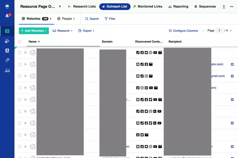
Buzzstream is a tool designed for managing link-building efforts for SEO. The idea behind Buzzstream was to provide a comprehensive set of features, from tracking Domain Authority and link status updates to offering email templates and performance analytics. While the intention was commendable, the execution falls short.
Imagine you’re trying to find the link-building analytics feature. It’s like searching for a needle in a haystack. The interface is cluttered, and the search bar isn’t even easy to spot—you’d expect it to be prominently placed at the top left or right of the main navigation, but it isn’t. This is a prime example of poor user experience.
From a product management perspective, this screams of a UX design that hasn’t undergone sufficient user testing. Users are left frustrated, wasting time trying to find basic features, which leads to a poor overall experience and decreased productivity.
How to Fix It
#1. Simplify the Interface: Start by decluttering the interface. Group related features together and use collapsible menus to hide less frequently used features.
#2. Enhance Navigation: Make the search bar prominent and easily accessible. Consider placing it in the top navigation bar, where users naturally look for it.
#3. Improve User Testing: Conduct thorough user testing sessions. Observe how real users interact with the tool, identify pain points, and gather feedback.
#4. Offer Tutorials and Tooltips: Provide onboarding tutorials and tooltips to guide users through the interface. This can help users understand where to find specific features and how to use them effectively.
#5. Implement User Feedback: Actively listen to user feedback and make iterative improvements. Regular updates based on user suggestions can significantly enhance the user experience.
Lesson to Learn
The key takeaway here is that even the most feature-rich tool can fail if it doesn’t prioritize user experience. Comprehensive functionality is important, but it should never come at the cost of usability. Always involve users in the design process, test thoroughly, and be prepared to make continuous improvements based on user feedback.
In essence, a good user experience is about making tools intuitive and easy to navigate. When users can quickly find and use the features they need, they are more likely to have a positive experience and achieve their goals efficiently.
#4. Examples of Poor User Experience: Amplitude forgetting to add an X to a modal
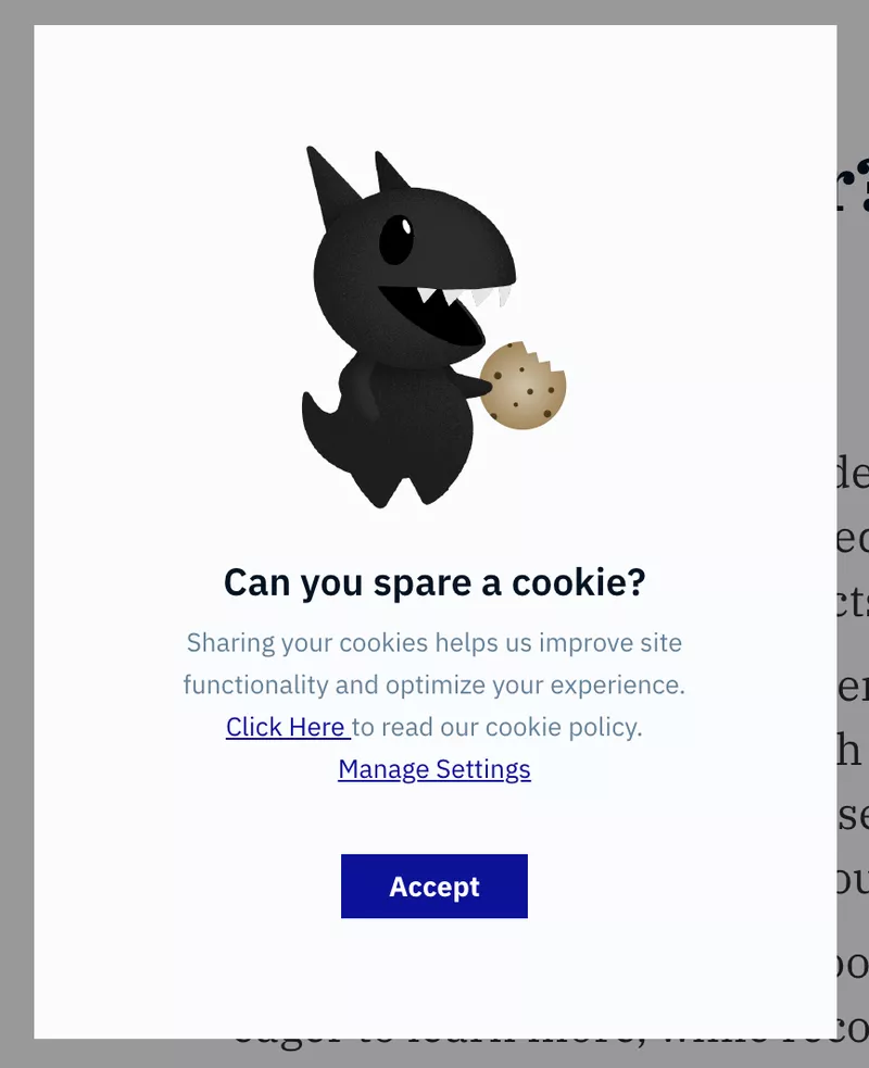
Amplitude is a well-regarded product analytics suite, trusted by big names like Ford and Walmart. Clearly, they’ve got a lot of things right. However, there’s one area where they’ve missed the mark: their modal pop-ups.
Imagine you’re deep into analyzing data for your power users, focusing intently on crucial insights. Suddenly, a modal pops up, interrupting your workflow.
You just want to close it and continue your work, but there’s no “X” button in sight. Your only options are to click “Accept” or navigate through the settings, hoping to find a way to opt out. This design choice feels manipulative, nudging you towards clicking “Accept” even if you don’t want to. The subtle guilt-trip in the header makes it even worse.
This scenario is a prime example of poor user experience. It disrupts your focus, forces you into actions you might not want to take, and creates frustration.
Let’s break down why this is problematic and how it can be fixed.
Issues with the Current Modal Design:
#1. Interruptive: The modal disrupts the user’s workflow, causing annoyance and potential loss of focus.
#2. Lack of Easy Exit: Without a clear “X” button or an easy way to close the modal, users feel trapped.
#3. Manipulative Design: Forcing users towards a particular action (“Accept”) is a dark pattern, which erodes trust.
#4. Emotional Manipulation: The guilt-inducing header text adds unnecessary emotional pressure, further detracting from the user experience.
Suggestions to Fix the Modal Design:
#1. Add a Clear Exit Option: Ensure every modal has a prominent and easily accessible “X” button or a “Close” option. This gives users control over their interaction.
#2. Respect User Workflow: Design modals to be less interruptive. Consider using non-intrusive notifications that appear in a corner and can be dismissed easily without covering important information.
#3. Avoid Dark Patterns: Instead of pushing users towards “Accept,” provide clear choices with equal prominence. This respects user autonomy and builds trust.
#4. Reconsider Header Text: Avoid guilt-tripping language. Use straightforward, neutral text that clearly communicates the purpose of the modal without emotional manipulation.
Lessons to Learn:
#1. User Autonomy is Key: Always design with the user’s control in mind. Provide easy ways for them to exit or dismiss modals without forcing them into unwanted actions.
#2. Transparency Builds Trust: Be transparent with your intentions. Avoid manipulative tactics that can damage the user’s trust in your product.
#3. Respect User Flow: Ensure that any interruptions are minimal and respectful of the user’s current task. Consider the context in which your modal appears and aim to minimize disruption.
#4. Clear Communication: Use clear, honest language. Avoid emotional manipulation and focus on straightforward communication about what the user needs to know.
Improving user experience is about respecting and empowering your users. When you make small changes to your modal design, you can significantly enhance the overall user experience, reduce frustration, and build lasting trust.
Remember, a good user experience is seamless, respectful, and transparent. Implementing these changes not only addresses immediate issues but also sets a foundation for a more user-friendly product overall.
#5. Examples of Poor User Experience: Pendo’s excessive use of tooltips
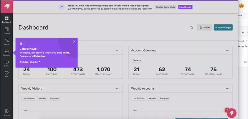
Pendo offers software that helps SaaS companies onboard their new users. In previous articles, we have discussed their product tours, and one example from that research stands out and is worth repeating here.
Pendo’s product tours primarily feature purple tooltips like this one:
While they do offer other UI patterns, the initial product tour presented when you first sign up for Pendo is almost entirely made up of tooltips.
There’s nothing inherently wrong with using tooltips in UX design. However, if a user is simply moving from one tooltip to another, reading dialogues without any interaction, it’s not very engaging.
I’d wager that someone who learns a product through hands-on action (or better yet, through play) will retain much more information than someone who just reads about it.
Relying heavily on non-interactive tooltips in product tours can create a poor user experience. Users are passively reading information rather than actively engaging with the product. This passive interaction can lead to:
#1. Reduced Engagement: Users might lose interest quickly if they feel like they’re just reading instructions without any practical involvement.
#2. Lower Retention: Information delivered passively is less likely to stick. Users who don’t actively engage with the product may struggle to remember how to use it later.
#3. Frustration: Users might get frustrated if they can’t immediately apply what they’ve learned or if the tooltips don’t address their immediate needs or questions.
Ways to Fix It
To improve this onboarding experience, consider the following strategies:
#1. Interactive Walkthroughs:
Incorporate interactive elements that prompt users to complete tasks as they learn. For example, instead of just reading about a feature, users could be asked to perform an action related to that feature.
Use guided tasks that require users to click, type, or navigate through the product, reinforcing learning through doing.
#2. Gamification:
Add gamified elements to make the learning process fun. This could include earning badges or points for completing certain tasks or milestones.
Implement small challenges or quizzes that users can take to test their understanding as they progress.
#3. Video Tutorials:
Offer short video tutorials that demonstrate key features. Videos can be more engaging and can show the product in action.
Allow users to pause, rewind, or skip parts of the video to learn at their own pace.
#4. Contextual Help:
Provide contextual help that appears when users are actively engaging with a feature. This could be in the form of pop-ups or sidebars that offer tips or instructions relevant to what the user is doing at the moment.
Ensure these help elements are easy to access and dismiss.
#5. User Feedback:
Gather feedback from users about their onboarding experience. Use surveys or in-app prompts to ask users what they found helpful and what could be improved.
Regularly update and refine the onboarding process based on user feedback.
#4. Progressive Disclosure:
Gradually reveal features and information as users progress through the product. This prevents overwhelming new users with too much information at once and allows them to learn at a manageable pace.
#5. Personalized Onboarding Paths:
Tailor the onboarding experience to different user personas. For instance, offer different tours or tips based on whether the user is a beginner, intermediate, or advanced user.
Use data from user sign-ups to customize the onboarding flow, addressing specific needs and interests.
Lesson to Learn
The key lesson here is that effective user onboarding should be engaging, interactive, and tailored to the user’s learning style. Passive learning through reading tooltips can be uninspiring and ineffective. Instead, creating an onboarding experience that encourages active participation, provides context-sensitive help, and incorporates elements of fun can significantly enhance user engagement and retention.
When you implement these strategies, Pendo can create a more dynamic and effective onboarding experience, ensuring that users not only understand but also enjoy using their product.
#6. Examples of Poor User Experience: ClickDimensions’ neurotic use of captchas
When it comes to marketing automation platforms like ClickDimensions, integrating with Microsoft Dynamics is a major plus. However, certain features, like adding multiple image CAPTCHAs to a form, can severely hinder the user experience. While the intention behind this feature is to enhance form security, it often ends up causing frustration for users.
Imagine you’re trying to complete a form to access crucial information or services, and suddenly you’re bombarded with numerous image CAPTCHAs.
The question pops into your head: “Just how many pictures do I need to click on to move forward?” This kind of friction disrupts the flow of the user journey, especially if it happens during a critical task. It’s a classic case of poor UX.
Image CAPTCHAs are not only annoying but can also be part of overly complex password requirements. Many users, including myself, have abandoned new platforms because of the endless rounds of image CAPTCHAs during registration. This frustration leads to “rage-quitting,” where the user gives up entirely due to the perceived never-ending verification process.
Why This is Bad UX
#1. Interrupts User Flow: Repeated image CAPTCHAs interrupt the natural progression of completing a form, causing unnecessary delays and irritation.
#2. Increases Cognitive Load: Users are forced to spend extra mental energy identifying and clicking on images, which can be taxing, especially if the images are unclear.
#3. Decreases User Satisfaction: Continuous interruptions lead to frustration, reducing overall satisfaction with the platform and increasing the likelihood of users abandoning the process.
#4. Hurts Conversion Rates: The more barriers you place in front of users, the more likely they are to leave. High friction equals low conversion.
How to Fix It
#1. Limit CAPTCHA Usage: Only use CAPTCHAs when absolutely necessary. Consider alternative security measures that are less intrusive, like honeypot fields or invisible reCAPTCHAs.
#2. Simplify the Process: If CAPTCHAs are required, ensure they are as simple and quick as possible. Avoid multiple rounds and use clear, easy-to-recognize images.
#3. Enhance Security Elsewhere: Strengthen security through backend measures such as rate limiting, monitoring for suspicious activity, and employing advanced AI-based fraud detection systems.
#4. User-Friendly Alternatives: Implement single sign-on (SSO) options using trusted services like Google or Microsoft accounts to streamline the authentication process without compromising security.
Lesson Learned
The key takeaway here is to always prioritize the user’s experience. Security is crucial, but it shouldn’t come at the cost of frustrating your users. When you minimize friction and providing a smoother, more intuitive process, you can maintain high security standards while keeping users happy and engaged.
In the world of UX design, balancing security and user experience is a delicate act. Always test and iterate on your security measures to find the sweet spot where users feel safe but not burdened by unnecessary steps. Remember, a happy user is more likely to become a loyal customer.
#7. Examples of Poor User Experience: Citibank’s Excessive Verbosity
Imagine you’re a new user trying to navigate Citibank’s online platform for the first time. You encounter a tooltip that’s so lengthy it covers half the screen, making it impossible to see or interact with other elements. Next, you face a modal that’s crammed with detailed instructions, overwhelming you and causing frustration.
To top it off, you’re guided through a product tour that insists on explaining every single feature, even the ones you’re not interested in, instead of focusing on the essential ones you need to get started.
This kind of onboarding experience can lead to user frustration and churn. Most users, including Citibank’s, are already familiar with common UI elements like search bars.
Over-explaining such basic features not only wastes their time but can also come across as patronizing.
Ways to Fix It:
#1. Concise Tooltips: Ensure tooltips are brief and to the point. They should offer just enough information to help the user without blocking the UI. For example, a simple tooltip saying “Search for transactions here” is sufficient.
#2. Simplified Modals: Design modals to be succinct and focused. Instead of cramming all information into one modal, break it down into smaller, digestible chunks. Use progressive disclosure to reveal more details only when necessary.
#3. Targeted Product Tours: Customize product tours to focus on the most critical features first. Allow users to skip or choose which features they want to learn about. This ensures they get the information they need without feeling overwhelmed.
#4. Contextual Help: Provide contextual help that users can access when they need it, rather than forcing information on them. This can include help icons or links to more detailed explanations.
Lesson to Learn:
The key takeaway here is the importance of respecting your users’ time and knowledge. Overloading users with unnecessary information can lead to frustration and abandonment. Instead, aim for a balance where users receive just enough guidance to navigate the platform effectively without feeling overwhelmed.
Imagine that You’re trying to check your account balance on Citibank’s app. As you hover over the search bar, a tooltip pops up, but it’s so long that it covers the entire transaction list.
You can’t click anywhere else until you dismiss it. Annoyed, you move to another task, only to be greeted by a modal packed with detailed instructions. It’s like reading a novel when all you needed was a quick hint.
Finally, a product tour begins, walking you through every feature, from currency converters to obscure settings, even though you only wanted to know how to view recent transactions. By the end, you’re more frustrated than when you started.
To fix this, Citibank should streamline these elements. Tooltips should be concise, modals should be brief and clear, and product tours should be optional and focused on key features. By making these adjustments, Citibank can create a smoother, more user-friendly onboarding experience.
In summary, effective onboarding should be about providing the right amount of information at the right time. Too much information can be as bad as too little, so aim for clarity, brevity, and relevance.
#8. Examples of Poor User Experience: Whatsapp’s Delete Message Feature

Have you ever sent a message on WhatsApp that you instantly regretted? Maybe it was a typo, a miscommunication, or just something you didn’t want to share. Naturally, you want to delete it.
But here’s the catch: when you delete a message on WhatsApp, it leaves an awkward “This message was deleted” notice in its place.
This notification is visible to the recipient, drawing attention to your action and potentially creating confusion, suspicion or curiosity.
This feature is a classic example of poor user experience because:
#1. Lack of Privacy: Users might want to delete messages discreetly without the other person knowing. The current system doesn’t allow for this, compromising user privacy.
#2. Unnecessary Attention: The “This message was deleted” notice can lead to unnecessary questions or discomfort, which is exactly what the user was likely trying to avoid.
#3. Incomplete Functionality: The option to delete messages doesn’t fully meet user needs since it doesn’t offer a truly private deletion process.
How to Fix It?
To improve this experience, WhatsApp could consider the following solutions:
#1. Silent Deletion: Implement an option for users to delete messages silently, without leaving any trace in the chat. This would respect user privacy and prevent drawing attention to the action.
#2. Grace Period for Deletion: Introduce a short grace period (e.g., 1-2 minutes) during which messages can be deleted without any notification being sent to the recipient. This allows users to correct mistakes quickly.
#3. Customizable Deletion Settings: Give users the option to choose whether or not a deletion notice is shown. This customization can be set on a per-message basis or as a general setting in the app.
#4. Edit Message Feature: Allow users to edit sent messages within a short timeframe. This feature can help fix typos or miscommunications without the need to delete messages altogether.
Lesson to Learn
From this example, we can learn a few important lessons about user experience:
#1. Respect User Privacy: Always consider the privacy needs of your users. Features that compromise privacy can lead to user dissatisfaction and trust issues.
#2. Anticipate User Needs: Think about the various scenarios your users might encounter and design features that accommodate those needs. In this case, users need a way to delete messages without causing a stir.
#3. Offer Flexibility: Providing options and customizations can greatly enhance user satisfaction. Flexibility in how features work allows users to tailor their experience to their preferences.
When this is addressed, WhatsApp can significantly improve user experience, making the app more user-friendly and respectful of users’ privacy and needs.
#9. Examples of Poor User Experience: Linkedin’s Empty States
LinkedIn offers a great opportunity for professionals to connect through groups. If you’re already benefiting from some groups, you might be excited to join more.
LinkedIn introduced the Discover feature to help users find new groups that match their interests. However, there’s a significant user experience issue: the “empty state.”
The empty state occurs when users are confronted with a blank or sparse interface without any guidance or immediate value.
In LinkedIn’s case, when users access the Discover feature, they see a lot of empty space with no clear direction on how to proceed.
This lack of initial content or prompts can leave users feeling lost and unmotivated. Instead of diving into the Discover feature, they might get distracted by other activities like checking social media or playing games on their phone.
Ways to Fix the “Empty State”
#1. Guided Tours and Onboarding: Introduce a guided tour when users first access the Discover feature. This tour can highlight the benefits of joining new groups and show users how to search and join groups step-by-step.
#2. Personalized Recommendations: Use LinkedIn’s data to show personalized group recommendations right away. If users see groups related to their interests and industry immediately, they’re more likely to engage.
#3. Interactive Elements: Add interactive elements like tips, suggestions, or even a chatbot to assist users in navigating the feature. This can make the experience more engaging and less overwhelming.
#4. Visual Cues and CTAs: Include visual cues such as arrows or highlights to direct attention to key actions like searching for groups or exploring categories. Clear calls-to-action (CTAs) can guide users on what to do next.
#5. Content Previews: Provide previews of popular or trending groups with brief descriptions. This gives users a taste of what they can expect and encourages them to explore further.
Lesson to Learn
The key lesson here is that a well-designed user interface should never leave users feeling lost or unmotivated. An empty state is a missed opportunity to engage users and guide them towards meaningful actions. When you provide guidance, personalized your content, and provide clear visual cues, you can create a more intuitive and engaging user experience.
Addressing the empty state in LinkedIn’s Discover feature involves:
#1. Implementing guided tours and onboarding processes.
#2. Displaying personalized recommendations.
#3. Adding interactive elements for user assistance.
#4. Using visual cues and clear CTAs to direct user actions.
#5. Offering content previews to spark user interest.
When LinkedIn fixes these issues, they can enhance user engagement, making it easier for professionals to discover and join relevant groups, ultimately improving the overall user experience.
#10. Examples of Poor User Experience: Apple’s Storage Management System
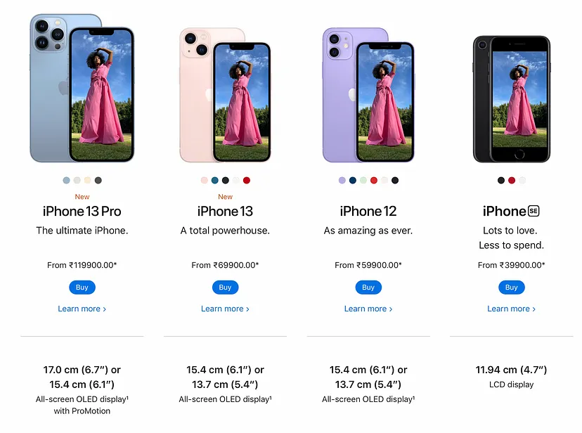
Imagine you’ve just gotten engaged and want to capture that special moment with your iPhone. However, when you open the camera app, it takes too long to load, or worse, it crashes.
When it finally opens, you find that your storage is full, and you’re prompted to delete photos before taking a new one.

This interruption and delay can be frustrating, especially during such a meaningful moment.
How to Fix It:
#1. Optimize App Performance: Ensure the camera app loads quickly and doesn’t crash, even when the device is low on storage.
#2. Storage Management: Provide users with suggestions to manage storage, such as automatic deletion of blurry or duplicate photos.
#3. User-Friendly Prompts: Instead of a generic prompt to delete photos, offer specific suggestions based on usage patterns or provide a temporary storage option for important moments like engagements.
#4. Preemptive Notifications: Notify users in advance about potential storage issues and offer solutions before they encounter problems during critical moments.
Consider implementing cloud storage integration directly within the camera app, allowing users to seamlessly store photos without worrying about device storage limitations. This not only improves user experience but also promotes ongoing engagement with the device ecosystem.
Lesson Learned:
The lesson here is that even industry giants like Apple can overlook the importance of a seamless user experience in certain aspects of their products.
It’s crucial for businesses to regularly evaluate their interfaces from the perspective of users’ needs and expectations, simplifying processes wherever possible to enhance overall usability and satisfaction.
Conclusion
We trust these Case Stpudies on Examples of Poor User Experience have been insightful, offering valuable lessons to you.
Mistakes are part of the growth process; the key lies in learning from them, take a learning space. Reflect on these bad user experiences from others and try to avoid similar pitfalls by following the best ways to fix them as suggested and recommended for you in the article.

